Overall I feel that I have done well in this project, I feel I could have done better at time keeping, but with the lack of time I did have I feel I have done well. The things I would change is that I would do things in moderation instead of all at once, also I would maybe used different materials to maybe make it look better then it is.
Thursday, 9 December 2010
My finished Video
Tuesday, 30 November 2010
Production Log - for video, billboard and magazine
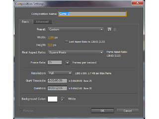 To begin with this is the screen that I get when I want to create a new composition. I have to choose the size of the composition, which in this case is 1280 x 720, which is standard for a widescreen video.
I also have to decide how long I want my video to be, which again in this brief has to be 30 seconds long, this is because normally adverts last about 30 to 60 seconds.
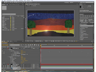
This is the screen that I have after opening the program After Effects. The next thing I had to do was to import all of the files that I would need to animate within my video. These could be either Illustrator files, Photoshop files, Jpegs or Gifs, it depends on the files that I want at the time. In this case I will be using Jpegs, Illustrator files and Photoshop files.
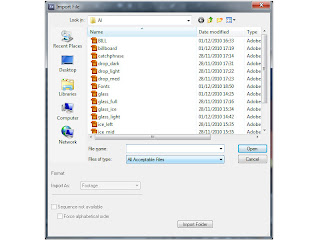
This is the window that I get when I want to import something, I also get asked if I want to make it a piece of footage, or a composition. And to make it easier for myself, I made everything that I imported into footage.
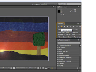
I also had to keep an eye of this window here, which has the frames per second in it, as long as it was at 25 frames per second then my video would run at the correct speed that I wanted.
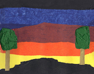
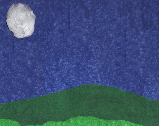
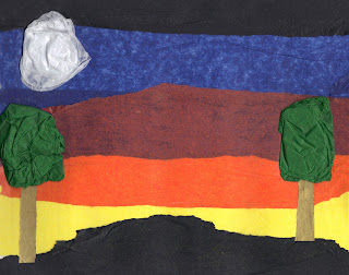
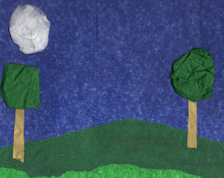
I had to use Photoshop to get the scenes that I had scanned in to the way I wanted, therefore to begin with I wanted the moon to rise up as it changed from one scene to another, therefore I had to crop out the moon from both scenes and then create a new file, which then made the moon layer.
 I also wanted to create the look that showed it was windy, therefore I had to use the same technique to cut out the trees to then make them sway in the wind as the clouds came across the screen.
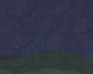 I then got told that my background images were not as dark as they should have been, therefore using Photoshop again, I copied a bit of the black tissue paper from the first scene and then made that piece partly see through, to allow the colours to come through and then copy that layer until the whole image was covered, to then create this darker image.
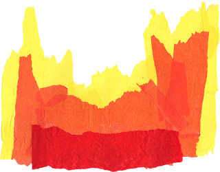
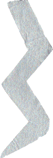 This lighting bolt I created to give me a way to make the different components appear, and after looking closer at dark things, I thought about a storm and that is how I came up with my idea, of having a storm, because lighting can create fire, and the rain can fill up a glass that I will create.
 This glass I created using an image from the internet of a glass. The way I created this glass was to first open a new document in Illustrator, and then use the line tool, and the circle marquee tool, making sure that the there was no fill, this is so the galss in see through, and then using the paint brush tool and different opacities of the same colour I was able to make the image look more like a glass. I then created another glass, with ice cubes in and then another one with the liquid and ice cubes in, this is so I can have each of the different stages.
However I found that I wanted the liquid to rise as it was raining and I wanted the ice cubes to move around seperately and the liquid rose, therefore I had to create the liquid and each of the ice cubes seperately.

 Here is the liquid and one of the ice cubes that I created using Illustrator. For the liquid I looked at a normal glass of Tia Maria to get the colours, I then founs that to add some sort of depth to it, I had to add different coloursm or at least different tones of the same colour, and with the ice cube I had to make it as pale as I could without completely not being able to see it, therefore I used a very light blue to go around the edges with.
 This image of the Tia Maria bottle I found by putting in a search into Google Images, I chose this bottle image because it is the most recent style bottle that there is, also due to it being quite a large image it is able to with stand being quite big, which means it doesn't get pixelated badly when I make it bigger.
 Here is the catchphrase that I will be using for my different forms of Advert. I had previously looked up different fonts at which I could use for my catchphrase, however after showing the class the different fonts they had chosen the same one that I was going to use. I chose this one because I wanted a font which had an old style feel (so like calligraphy), however have a dark side to it, which I felt this one had.
After getting all of my components in place and moving to the music, I showed my animation to one of the tutors, and they suggested about having more things happen in the first scene, especially as I did not really have anything happening. Therefore I decided to make my moon rise. As I was doing this, someone had spotted that my moon was rising in front of one of the trees, also it was rising too straight. Therefore, I made it so that my moon started off of the screen and then from the start of the video to when the scenes change, my moon would rise, until it is in the correct position for when the static moon faded in.
I also wanted to add something else, to give the impression that the sun was going down. Therefore, after having an experimentation session I found an effect which gave me that option. This was called Lens Flare. And I had it slightly moving giving the impression that the sun was setting as well as fading out as the scenes changed, this then made my scene change a bit more realistic.
I also wanted to add another effect that would fit in with the theme of my advert, and this was rain. I wanted to have rain in my scene because, generally with a storm there is rain, also this ment that my glass could get filled up. The way I found this effect was by slowly looking through each of the effects, and in the simulation section there was one calle CC Rain. The way I created it was to first make a new composition, which was the same size and the lower section of my animation, and then add in the background that I was using, I also made it about 12 seconds long, which is the length that I wanted it to run.
I then played about with the different setting and I found I could change the speed, angle and amount of rain I could have, therefore, using previous experiences of storms, I wanted to have it come in slowly and then get really hard, to the put out the fire, and then go quite soft and then hard again, this allows me to the fill up the galss realy for the end position.
 Once I had done all of my animation a tweeked what I needed to I then had to render my animation out into a .mov, which will then allow me to convert the .mov to a .ogv and a .mp4 (this process was so that people could watch and access my advert via iPods, iPhones, iPads etc.). I also had to render my video out as a H.264, which meant it is the best quality video I can make. The way I changed my settings was to first click on a part that said 'lossless' and I can change my video and audio settings there, and the change where I saved it I clicked on the one just to the right of the last one.
The way I convert my videos is to use a specific program called Miro. This allowed me to convert my .mov movie to a Theora movie, which can be played via Firefox and mp4, which can be played via QuickTime.
Once I had finished creating my Video I then had to start on creating my Billboard, Magazine and Poster. Creating these were very simple, in the sense that I had everything that I needed I just needed to put the components together in a way that looked good as a print ad.
To do this I used Illustrator, and to superimpose them into the points that I wanted I use Photoshop.
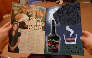
Here are the jpegs of the finished adverts:
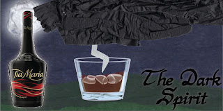
The one of the left is for the billboard and the one of the right is for the poster and magazine. I had to look up the sizes for the billboard so I could then scale it down to fit on the image that I had taken previously.
Here are the images superimposed onto the photos that I had taken previously:
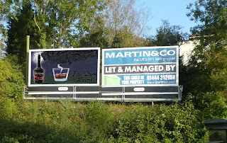 This is my superimposed Billboard Advert. With this advert I had to used the Transform tool and the scew tool, this is so I can fit is properly to the edges.
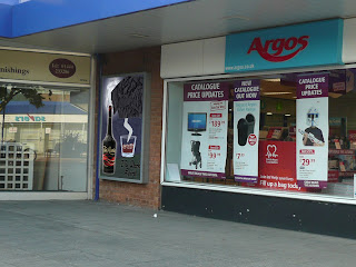 This is my superimposed Poster Advert. With this one it is the same as the Billboard, I just had to use the Transform tool to get all of the edges close to the edge of the poster.
Friday, 26 November 2010
Images from Sketchbook
 me to use them in my
  animation.
 This is one of the threee clouds that I have created, using tissue paper again. I decided to only show one as each of the others are of the same design, just different shapes.
Monday, 1 November 2010
Changes from Pitch
I therefore decided to change my idea and music to something that was more suited to the theme of my, and after showing my tutors my new idea and the fact that I was going to use the same material throughout, they said that, that idea was a better idea then my last idea, and therefore I have decided to carry on and develop my new idea.
Research into Handmade Videos
Here is some research into other different videos that look handmade, whether they be music videos or adverts.
This is a video that I was shown that uses Stop Motion animation. 'Stop-motion (also known as stop-action or frame-by-frame) is an animation technique to make a physically manipulated object appear to move on its own.' (from Wikipedia). I like this advert because the creators had used many different elements that were mentioned within the song. Therefore they had a de range of things to animate, which then allowed them to become really creative in how they incorporate those elements within the song. My favourite part of the video is when the fruit comes in and then makes a face, which then looks like it is singing along with the song.
This next video that I found when watching Television, is advertising an Amazon product called the Kindle. This video also uses Stop Motion within it, this is so it can create the animation that the creator wanted to create. The bits in this video I like is when the material is scrunched up and flattened out and made to look like different things, for example it is first made to look like a shot from a gun, then a shower curtain (like a scene from the movie Psyco) and lastly like a stage curtain.
This is another Kindle advert that I had found, using YouTube. I feel that I prefer this video to the last video, mainly because this has more to do with what I might want to do for my project, using paper. I particually like the part where the paper is scrunched in and then flattend out again to make different effetcs.
Pitch and Analysis
Research into Different Brands of Alcohol
- Harveys
- Guinness
- Tia Maria
- Malibu
- Cremont
- Tequila
And using these drinks I will look into them closer to determine which one I would like to use.
To begin with I will be looking into Harveys.
Unfortunately there are no televised adverts for Harveys, therefore I cannot make any analysis on what they are like. However, I have found an image that I could use as a basis.
 This image portrays the brewery in an old style painting like image. This may be because they might want to show that the brewery has been around for a long time and therefore the setting that the brewery is in is also old style.
Guinness:


 Each of these are posters that Guinness have used to promote the drink. Each of them have a character within them that makes the campange more personalised, which then allows for people to be able to relate to them.
Here I have found 2 previous adverts that have been created for Guinness.
Each of them are different however there are some similarities, for example the catchphrase 'Good things come to those who wait.' This phrase demonstrates what people will have when they order a beer. Another common link between them is having normal, everyday people doing things that are different, one shows the evolution of man (backwards), whilst the other is a village full of people coming together to create a large version of dominos. Each of these are interesting to look at, and having looked at each of the posters and video closer I feel I could create something similar. However, I will not be choosing Guinness because their adverts (print and screen) are so widely recognised that there will be an enormous amount of pressure to keep up the standard set.
Tia Maria:
I did look into print adverts for Tia Maria however I could not find any that I could use therefore I will be only analysing the screen work.
I have chosen one of the original videos that was used to make Tia Maria a well known alcoholic brand. Using a famous model (Iman) the consumer are able to remember the drink from the advert via remembering the model. However, since that advertisement, in the 1980's, Tia Maria have not used famous people anymore, they have just continued the theme of making Tia Maria an after Dinner, sophisticated drink. However, since 2001, Tia Maria Changed their Advertising, I think because this allows for the target audience to be widen, and not just to older, and more sophisticated adults. Their advertising now to a younger audience, making the adverts more sensual and exciting, and the tag line used is 'The Dark Spirit.'
Malibu:
 Here are 2 Posters that were used to advertise the product.
I feel that these are very colourful and interesting to look at. Also, due to the nature of these they look homemade.
Here are 2 videos that I have found using YouTube. Each of these use a caribbean theme, which relates to the theme and the flavour of the drink, which is coconut.
I feel that each of these videos are quite humerous, therefore if I were to create something for this brand I would have to carry on with that humerous style, as well as making making it very colourful.
Cremont:
Unfortunately due to the lack of knowledge people rarely know what Cremont is. Cremont is basically like Champagne, however it is from a different region (burgundy). And therefore has a different name. I am unable to find any sort of advertisement, therefore I can then not analise anything. However, from my knowledge of the drink I am able to determine that it is a drink for special occassions.
Tequila:  Here is a poster that was used to advertise a popular brand of Tequila. However, I recognise the branding, but I do not recognise the poster that I have got. I feel that this poster includes an old style theme of black and white, and then using a colour, which then makes the brand stand out.
Lastly I have found 2 videos that allows me to see how the advertisers advertise this brand of alcoholic drink.
The first one looks like an advert for a film, by using stills of the characters, quotes (as if from critics) and colours and greyscale. I feel that this advert is effective because it makes the advert seem personalised by grouping the types of people, that the audience would relate to.
The second video is a bit confusing, mainly because there is no clear indication into what the advert is about until quite a way into the video, and even then I cannot really undertand it properly. This is not very good, because if the audience does not understand what you are trying to sell, then you won't sell anything.
Brief - Handmade
I will take the idea of starting with traditional media and use the results of my experiments with those media to create the next developmental step of my designs from handmade elements through digital manipulation to a full blown moving image advert which will be rendered as a movie for presentation to a client on a DVD and made ready for use on a smart phone or portable device. I will also create a billboard poster and full page magazine ad design as part of my advertising campaign.
Sunday, 17 October 2010
Evaluation
My Varese Animation
- Speed of Change
- Timing
- Arcs
- Motion Blur
- Squash and Stretch
- Motivation/Anticipation
- Follow Through
- Overlapping Actions
- Staging/Exaggeration
My Bins Animation
Here is my finished Bins Animation, I have rendered it out into a Quick Time movie.
- Timing
- Speed of Change
- Arcs
- Squash and Stretch
- Motivation/Anticipation
- Follow Through
- Overlapping Action
- Staging/Exaggeration
My Bongo Animation
This is my final Bongo Animation, which I have rendered into a Quick Time movie.
I feel for this animation after changing the colours I feel that the idea works well, in comparison to when I had the primary colours.
The lighting problem that I had, at the beginning, was that the beams of light did not look like spotlights, therefore to solve that problem I found a lighting effect that I had put onto the triangles, and once I did this I found that they then looked like spotlights.
- Squash and Stretch
- Motion Blur
- Motivation/Anticipation
- Overlapping Action
- Staging/Exaggeration
Sunday, 10 October 2010
Colours


Friday, 8 October 2010
Production Log for Hyperprism Animation
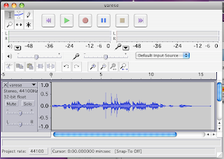 With this animation I first had to cut up the music, which would allow me make my animation easier. I did this by using Audacity. I first opened the original music within Audacity, I then found my section of music, I then selected it and I cut it out of the original, I did this by pressing Apple+X on the keyboard (which is a short cut for Cut). I created a new file for me to paste the section of music into. I then exported it as an .wav, which is a format that After Effects can work with.
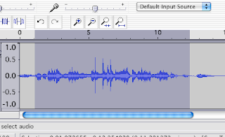 Here the section of music I selected for my third animation, and using the wavelengths I will be able to figure out the points, which I will need to make object move.
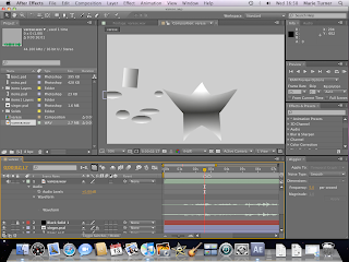 I first made my objects in Illustrator, this is because I wanted to have gradients on them, this is so I can make this animation seem like an older version of the other animations, (by using greyscale and black and white, like old films). I first began with the star in the middle of my screen, emulating a singer or something similar. To create the movements from my storyborad in After Effects, I had to use the Puppet tool.
 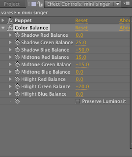 After having created my star I decided to create a duplicate star, which at the end will steal the spotlight from the bigger star. However, I found that to begin with having to 2 stars the same colour didn't make the second one stand out as much as I would like, therefore thought that I could change the colours or tones of the second star to make it stand out.
 Production Log for Bins Animation
I first used Audacity to cut up my music and this allowed me to sut it up very specifically to where the music faded in and out easily.
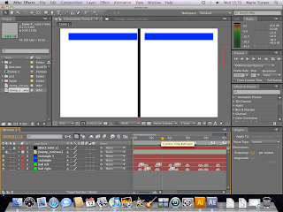
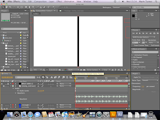 I had to use my storyboard at which was in my sketchbook to create this idea. I first began with a single black line, which I placed in the middle of the screen. This black line would allow me to have the objects use it as a way to emulate that the objects are creating the sounds. The way I created the black line was by creating a new solid, and then changing the size of it by using the cursor and the corner, and then dragging the corner inwards until the black line was the size that I wanted.
 This particular song is quite hard to determine where each of the sounds are, therefore I had to extend the music layer to allow me to see the wavelengths, which then allowed me to point out all of the different sounds by both looking at the music and listening to it at the same time.

Tuesday, 5 October 2010
Production Log for Bongo Animation
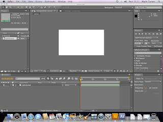 To begin with I had to open up After Effects, and then create a new project, including a new composition. When I created a new composition I had to put in a few settings that we got told that we had to use, for example the size which was....
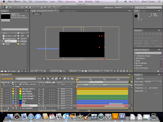 I then had to start with a black screen, which would allow me to fade into my animation. I also wanted to have the background as black (or dark grey), this is so I can show the spotlights, which I wanted to use to create the staging for my animation. The way I made the background back was by using the composition settings and changed the colour to black. I then created a new solid, which would allow me to have a fade in, I right clicked within the areas where all of the layers are and then selected New/Solid, this is where I could change the colour and the size of the solid, and in this instance I wanted to have it the same size as my animation screen.
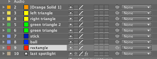 Here are all of the layers and objects that I had created to get my animation.
 I first began with creating the first objects that would be seen, which were the first spotlight and the 2 yellow triangles. The way I created the spotlight was to have a mask of a triangle over the background colour. The only way of creating a triangle was to use the star mask tool and then by pressing on the down arrow key (on the keyboard) I was able to limit the number of points to 3, which consequently created my triangle. I then used the same technique with my yellow triangles, except the way I did this was to first create a new solid, then using the star masking tool I created the triangles.
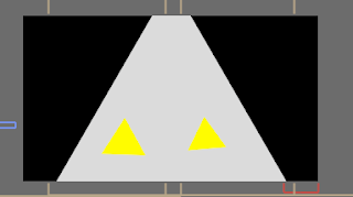 The first action I wanted them to do was sway from side to side to each of the beats, and the way I created this was by using the rotation tool and moving the slider along the time line at each of the places that I wanted the triangles to hit each of the beats. However when I showed my initial design to my tutors, they pointed out that there was a big gap from when the music began to when the movement began, therefore I decided to have the triangles walking towards the front of the scene, however to making it a bit comical I decided to have one come in a little later then the other one, to emulate that one was late and therefore trying to catch up so they do not miss the start.
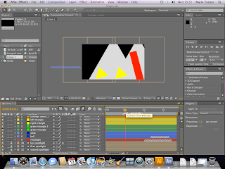 I then want to have another spotlight lighting up the second solid that will be creating another section of the music, therefore I duplicated the original spotlight and changed the position, and to make it come on when I wanted it to, I used the opacity tool on it (making it 0%), and using keyframes, I placed the slider where I wanted the spotlight to come on, however if I kept it like that with only one keyframe I found that the opacity would change gradually, therefore I added another keyframe just before the 'on' keyframe and I made the opacity 100%.
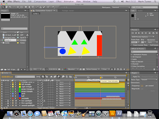 I then had the third spotlight appear, when the last bang sounded, and this revealed a ball, as well as 2 other triangles abover the original triangles. The ball would create the beat for the second part of the song. However, I did have an issue, because in real life a ball doesn't start bouncing by itself therefore I thought about having a stick come in and tap it to make it bounce to the beat. The green traingles where also part of the second section of the music, this is because I found that there were to different bongo noises at that point, which then made me add in these other triangles to allow for the other bongo sounds to seem like they are being created by another object(s).
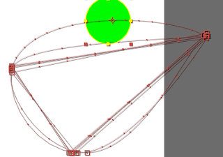
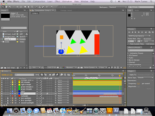 To make the ball more realistic, I had to use the principle squash and stretch. Basically, I used the scale tool, the position tool, and the slider to make my ball seem real as it bounced. To begin with, when the ball hit the bottom of the screen I made it squash and as it fell and raised I made it stretch, and then only point that the ball would be normal size is at the top before the ball began to fall.
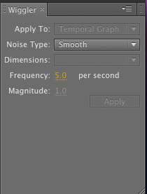 The way I used this tool was to select the 2 points from my position section, and then select how many times I wanted the object to shake per second, I also had to select how much I wanted it to shake. To get the square shaking perfectly I had to experiment, until I got the right settings
Here is my when I imported it into quick time.


