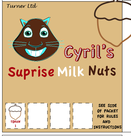
During my 'Crit' session I had many various comments both good comments and comments saying about things that I need to work on.
On the front of my box, I got told that the typography of my company name was too old fashioned and it didn't work with my theme, therefore I had changed the font so it matched the theme and the whole affect. Also with the front I was told that nothing really worked together and I needed something to bring the character and the text together, therefore I had previously on the back of my box a tree that I had used for my maze so I copied it across, then changed the stroke to make it thicker, and then placed everything around it to that everything then worked together.
The comments were generally good for the sides however, the typography of the turner's needed changing, and then the small squirrel almost faded into the background and therefore I had made the character lighter so that it stood out from the background.
Also for the sides, I had another comment to get rid of the stroke on the 'Cyril the Squirrel' text, therefore I did an it stood out better then with the stroke.
Lastly, I had another comment that said about the spacing of my 'Cyril the Squirrel' text, and therefore I had changed that, as well as I needed to make the text thicker to show off the lines more.
All in all once I had changed the points that I had comments on, I feel that my box is a good representation of a standard on the shelf biscuit box.


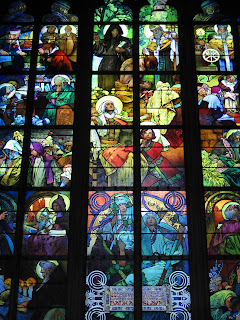

 Rene Lalique:
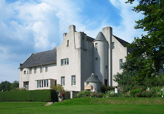
 Charles Rennie Mackintosh:


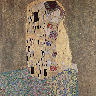
 Alex Katz:


 company name not on the back of the box, therefore I used that information to then change the 1 thing that needed changing.


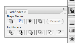 Once I have Ungrouped everything, I then go to Windows/Pathfinder, and then I will get this window pop up, and the tool that I would need to break up everything is the bottom left tool, which is 'Divide', but before I do that I make sure that everything that I want to manipulate is selected, I can do this by a keyboard shortcut, which is Control/A for a PC or Apple/A for a Mac.


