First I looked back to the example of postcards that I had collected, and then to get the size of
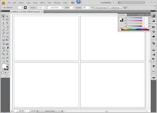 my postcards the same, I decided to measure the existing postcards and that is how I got the size for my postcards.
And as you can see here I have made one and then I had copied it 3 times to make the bases of my 4 postcards.
To start my first postcard I had to choose the correct colour that matched my designs, (and before all of that I had to make
sure that the colour mode was CMYK, as I will be printing these out). 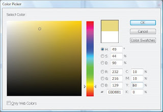
In this screen grab I show the percentages at which I have made my colours, using the CMYK, but to get to that stage I had to experiment with different percentages to see if I could get a colour that was either the same or similar to the design at which I had done in my sketch book.
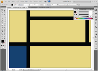
Here I have chosen the background colour, and using my designs from my sketch book I was able to place the black stripes in the correct places, and then I chose the right colour for the blue section, I thought to myself for the blue I had to chose a shade of blue that wasn't to bright
however it needed to stand out, which is how I came to choose this shade. I then did the same for the red colour that I had at the top of the postcard.
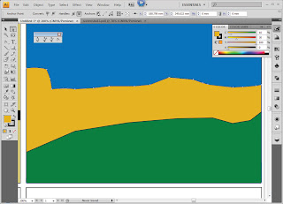 The second one I had to start with the blue as the background, and with this design I wanted to make it quite bold, but not to bright. I then used the pen tool to make my yellow section and the way I made the edges curve was by using another tool, which was part of the pen tool section, this is the curve tool, I then repeated the action with the green section.
 The way I determined the colours was to first look back at my design to see what sort of colours I used, and then using my sketch book as a reference I was able to pick out my colours through experimenting and eliminating the shades or colours that I did not want to use or I did not think was right for this one postcard design.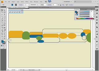

Here I took a screen grab of the third postcard that I had designed. The design came from one of Alex Katz's collages that he had created.
How I did this one, was by first deciding on the background colour of my postcard, and then adding all of the different shapes that I had designed in my sketch book. I also made sure that each of my shapes had no fill and a black stroke/outline, this was so I could place them in the correct places and then fill them in once they were are placed and in the right order, and because I had used only a minimal amount of colours I was able to change them in groups by clicking on one and then holding down the shift 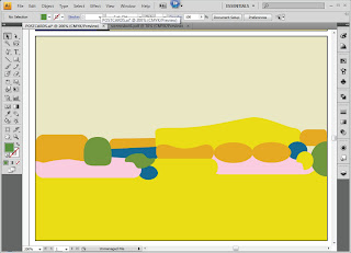 key to select more at the same time.
 key to select more at the same time.
Using my finished sketches in my sketch book, I then used the white arrow tool to manipulate so of the objects, this is so that it was look like my designs. The way I manipulated them by using the white arrow tool, was to select the points at which I wanted to change and the either dragging them to a certain place or even deleting them if they were not needed.
As you can see here I have filled in all of my objects and I have taken away the stroke. Moreover I have looked again at my sketches and I found that I used a darker tone on the bottom then the top, hence the change fat the bottom.
 Here is the last postcard design, and with this one I wanted to use my knowledge of colours to help me determine what colours I used.This one was a bit different to my sketch book design because with my sketches I had basically copied Katz's work, and what I wanted to achieve was an understanding of his work and therefore I had changed my design from flowers to leaves, however keeping with the same ideas.
Using my knowledge of colours I thought to myself as leaves are green I will use the opposite colour on the colour wheel to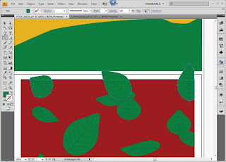 make them stand out, which therefore allowed me to make a decision on the background colour being red.
 make them stand out, which therefore allowed me to make a decision on the background colour being red.
In this screengrab I had already drawn a leaf, then I had copied it many times, and then manipulating them to make them each look different.
To create the effect of the leaves going off the page I had first placed some of the leaves over the edge I then, using the line tool, placed a line on the edge of the postcard, I then went to Object/Path/Devide Objects Below, this then allowed me to delete the excess parts of the leaves that I did not want, and this allowed me to a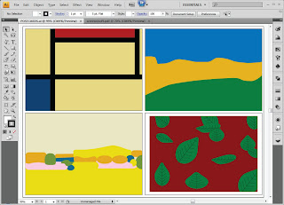 chieve the effect that I wanted.
 chieve the effect that I wanted.
In this last screengrab I have shown each of my postcards, and these are all different takes of Alex Katz's work, I wanted to show that I understood the way at which he worked, and the way he used colour to create his designs.

No comments:
Post a Comment