
Using the paint brush tool I first draw out the image, this would then allow me to fill in the spaces once point at a time, however in the final part I would not have any outlines or strokes.
I also adapted my other design for the poster itself, instead this time I will have a white border all of the way around the image in the middle, with the text above and below the image as like my Tree poster.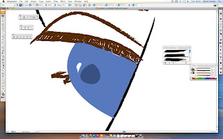

Here I am creating the left eye, which is no completely visable, I first used an art brush to create the paint brush stroke effect.
Then I drew in the eye lid in the same place as to where the original image is, I then tried to match the colour of the eye itself, also the white dot in the middle of the eye is not an error I had put it there because I was copying the original, and hopefully using the small details would make my poster stand out.

I then filled in the colour of his hair first with a base colour, as I assume the artist would have done. I then added strokes of different colours to give the hair some natural highlights that were shown in the original, some of the strokes I had changed the opacity to make them look more effective.
I also did a similar technique with the eye brows, this is because this would hopefully give my image some depth, by adding the shading that is in the original.

I then gave my face the base colour for the skin, and after showing it to my peers someone had mentioned that on the original there is some sort of shading all over the face.
I therefore chose to use the same effect as I did for the Building Poster and that technique is Gradient Mesh.
Now I had figured out how to use it, I thought it best to use it for this problem.
Therefore I had to experiment with different shades until I had found the right one for me, after that I then added the gradient mesh by pressing the 'u' key of the keyboard, selecting the points that I wanted to change the colour of and then selecting other points that I wanted to be the skin colour, and this gave me a shadowed effect.

I then used the gradient mesh on the other parts of the face as well, for example the eye, where on the original there was some shading around one of the eyes as shown here.
However due to the nature of the shadow, and due to the shape I had to experiment again with the colours until I achieved the right effect.
I also had to change the size and positioning of some of the point in the gradient mesh and to do that I had to first select the white arrow tool and then select the points I wanted to move, and then move them to the correct positions.
And for my shadow to work I had to make the  mesh fairly big, and make sure it was under the eye itself.
 mesh fairly big, and make sure it was under the eye itself.
Here I am showing the whole poster, that is because I had finished with all of the different sections of shadowing, and this is a way to see what I looked like all together.
I then showed my poster to my peers and tutors, and someone had mentioned that my border line looked like it shouldn't be there, so I had to make it thicker and more defined, also as the same as the Building Poster the date typography did not look professional, therefore to keep the designs the same and continuous I chose the same font as before, Helvetica.

And here is my final product, also it make the image itself stand out I also changed the white spacing in the image just off white, this was so it didn't blend in with the border.
I also changed the Kerning of the date text as well, just like the Building Poster, I did that because this would then make the poster look more professional, even though it is only a tiny detail if this is what I want to do, then I should be looking out for it.

No comments:
Post a Comment