
I begun with opening a document in Illustrator making sure that it was A3 and the colour mode was in CMYK (this was so I could print it out without there being any colour problems).
I then started with the background colour I had noticed in the original that the background colour was quite a darkish red, therefore I had chosen this colour.

I then added the building making sure that the colours were first complimentary to the background, so that I wouldn't clash, also make sure that the colours were almost the same as the original.
I used the rectangular tool to first create the main area and then the 2 chimneys on the top, to create the triangle on the side I used the star tool, and then pressed the downward arrow on the keyboard until the shape was a triangle (pressing the up or down arrows on the keyboard would increase or decrease the amount of points on the shape).
 I then added the windows that were showing in the image, however I did not copy the original completely because I wanted to use it and make it my own, therefore I placed in more windows and placed them in different positions.
 At first to make them stand out I made them white, and at first they had a black stroke around them at which I did not want therefore I got rid of the stroke.

I then put 2 television aerials on the top of the building and to make sure that they were not the same I draw them each separately using the line tool, and to create the dish on one of the aerials I used the circular tool.
By doing this, I was hoping that it would give my image a sense of realism like Katz's original.

I then added in the name of the artist and the years at which he worked. I thought to myself that I would like to make the name and dates stand out otherwise people would not know who I am supposed to be advertising, therefore I places a white box around the text, and this made it stand out.
Also putting a white box with the text in it, and then placing it in 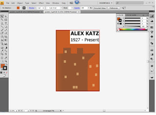 a corner I found it was of a similar style to the book at which was on Alex Katz.
 a corner I found it was of a similar style to the book at which was on Alex Katz.
I then took another look at the original and then compared it to my design. I had then found that the colours were too bold and the image was too flat and on the original the building seemed to have faded into the background on one side and the windows did not stand out as much as mine.
I therefore changed the colours so that I would suit the original more and hopefully make mine look better, I then used the colour swatch that I had chosen previously and then I used another colour for the windows.
To make the building blend into the background on one side I used a technique called Gradient Mesh. I first pressed 'U' on the keyboards and then I selected the points at which I wanted to change, I then selected other points and using the Ink dropper tool (i on the keyboard) I was able to choose the background colour, this then showed the building fading into the background on one side, like the original.
 I also noticed that on the original that the windows that were placed on the outside of the building Katz had put them at an angle or in perspective, like they were on another building that you couldn't see, through the fog that was portrayed.
 Therefore to create this effect I selected the windows that I wanted to give perspective to and I then I went to Effect/3D/Extrude and Bevel.
I would first make sure that the preview was checked so I could see what I was doing. I then changed the extrude depth to 0 pt so that the windows would not become 3D, I then started changing the Perspective of them.
I experimented with the different setting until I got the effect that I wanted.
I then noticed, as I have said before, there was a foggy effect on the original therefore to achieve the same effect I just made a box and filled it with a light grey, I then made sure that it was only over the image and not the text, then to allow the image to come through I decreased the opacity of the grey section to about 30% and this allowed me to achieve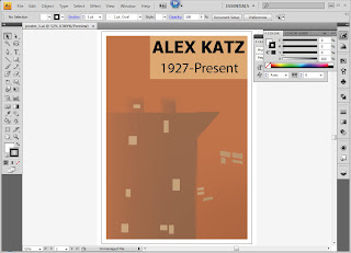 the foggy effect.
 the foggy effect.
I then showed what I had done to a few people as well as my tutor and someone had suggested that I should make the background of the text box the same colour as the windows, because then it would fit in better with the poster, also someone else suggested about putting a white border around the whole thing, this was to make it look more professional.
And lastly, my tutor had mentioned that the typography for the date section, did not look professional therefore I changed it to another font, Helvetica, this looked better, and then using the Kerning section in the paragraph window I was able to make the space between the '-' and then 'P' a bit bigger so it would match the spacing between the '-' and the '7'.
After all of the different trial and errors I came across I finally came up with my final design, which is in the last screen grab.

No comments:
Post a Comment