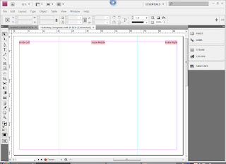
 First I had to create a template to which I will have to work in, and this will help me to create my Gateway Leaflet.
I opened a new document in InDesign, making sure that first the Master Text Frame box was ticked, as previously advised, I then went about changing some of the default setting to the settings that I wanted. For example I wanted the page to be A4 and in the Landscape position, and once I had made all of the necessary changes I then had a basis at which to start building my template.
Then I used the rulers, which were to the left and on the top of the work area, to measure the right dimensions for where I will need to place my text box. And then using my Text tool I had placed the boxes in the same positions. And to make sure I knew what to put where I then labelled each of the sections.
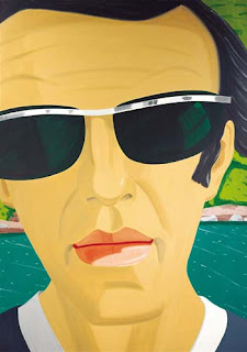
For the front of my leaflet I wanted to place this image on the 2 sides so that when you put them together it would make the complete image and that will be in the center of my leaflet.
In this screengrab below, I am designing the front and back of my leaflet, I first tried to separate the Alex Katz image using Illustrator however, I was unsuccessful, I therefore decided to copy the image and place the 2 images at opposite sides, making sure that they are perfectly aligned. I then decided on the back I was going to put a small bit on information about the artist as well as a photograph of himself. I then 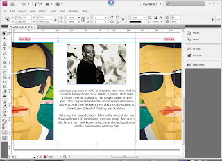 tried printing the page out and folding it to make sure that the template and the design worked, and they did (I put the print outs into my sketch book to show my progress).
 tried printing the page out and folding it to make sure that the template and the design worked, and they did (I put the print outs into my sketch book to show my progress).
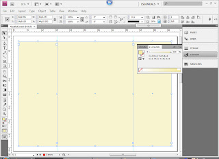
As I then knew that my leaflet design would work I then decided on colours for the inside and the front and back of my design. I wanted to carry on with a similar style to which Katz worked, therefore I went onto Kuler and found 3 different swatches of colours that I felt best went with Katz's style, I then chose a main colour swatch and this allowed me to have the 2 colour that I have used for my leaflet.
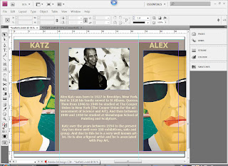 Here I am showing how I placed my colours, I first filled each of the 3 sections in with the same brown, I then decreased the opacity to about 50%, this is so it does not over power the writing and images. I then found because I had decreased everything in the boxes I had also decreased the opacity of the text as well, therefore I just copied the right sections and then paste in place, which then gave me a 3 toned effect when I printed it out for a test. I then moved the edged so that the white and the lighter brown was of similar widths, this was so that I looked better a
 nd more orderly.
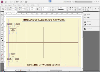
Once I had finished with the front and back, making sure that the finer parts were sorted, I then concentrated on the inside making sure that I had enough information to allow myself to create a quite filled timeline of Alex Kat'z work and life.
I got this information from his website http://www.alexkatz.com/ and on this website it a mini biography and a full biography, and this allowed me to get the information that I needed.
I then first went through all of the different exhibitions and parts of his life that I felt was quite substantial, I had to make sure that the choices that I made were relevant to the artist, also because Katz's had been having exhibitions since the 1950's to the present day there was a lot of information that I could have used, But I made sure also that I had chosen parts of his life and work from every decade. This was to show that he has been around constantly.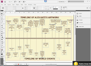

I then decided to show what was going on at the same time in the rest of the world, this was to see if there were at any point a time or place that influenced Katz at all, and if not then it would just show what Katz had to work through.
The information that I used I had got from one particular website, at which I had found through Google search, after putting in world events and then a year, www.historycentral.com/Europe/Index.htlm, there were a few coincidences that I have found for example in 1989 Katz had an exhibition in West Germany and in the same year was when the Berlin Wall came down.
After looking through the 2 different timelines, I feel that the world events really didn't have any affect on Katz's work because as I look through there were no really changes to his style, therefore it shows that he is consistant in his work even through difficult times.


No comments:
Post a Comment