Sunday 31 January 2010

My flow Diagram

Definition of Flow Diagram (from Wikipedia) - A flow diagram is a diagram that describes the process of a website, normally how everything is linked.

Once I had done some primary research on colour, for my website I was then able to create my flow diagram at which shows what pages are linked and how.

Here is my final Flow Diagram:

Friday 22 January 2010

Research on Colour - Moods and Colour

Colours are not only nice to look at they can also be used as a sort of therapy for different people. They say that you can use colour to either create a mood or help to change your mood.

For example:

Red, there are many different symbolisms for this colour: passion, love, anger, pain, blood.

Here I have found an image where the colour red was used, as you can see the object is in the shape of a heart and a heart is a sign of love and maybe even passion.

However, even though this object and many others have a nice feeling with it, there are also images that have horrible feelings, for example images of blood or the devil, as red is also associated with these as well.


Here is another colour that has moods, yellow: Yellow can be represented by flowers, the sun etc. However due to the nature of the colour, the emotions that are normally linked with yellow are nice.

Here I have found an image of the sun, sun can make you feel warm and happy.


The last colour that I am going to link to moods is Blue.

Blue, in many societies is has normally got different moods that are linked, for example cold, calming, sadness etc.

I have found an image that portrays some of the emotions that I have previously mentioned, especially Cold and Calming.

These examples are to show what I am hoping to show in my website and I will explain further into linking moods and colour, and colour theory itself.

Research on Colour - Colour is Light

It is said that there is no colour only light. This can be proved by a Prism, if you shine a light through a prism multiple colours will be reflected out of one of the other sides.

Here is an example of what happens when a white light hits a prism.

Light consists of electromagnetic waves, and to create the white light that then splits into the other coloured lights there is a mixture of equal amount of wavelengths and frequencys.

Here I am showing the different wavelengths and frequencys that each of the different colours have once they have been reflected through a prism.
As you can see here the red colour at the top has longer wavelengths with a lower frequency and at the bottom the violet has shorter wavelengths with a higher frequency, this range of wavelengths and frequencys allows each of the colours to become visable by themselves.

The way we see colours everyday is where a particular colours is being absorbed and then reflected back to our eyes. For example a leaf absorbs the all of the coloured lights and then the green light is reflected back to make the leaf look green.

Tuesday 19 January 2010

Research on Colour - Colour Wheel

Due to the fact that I had chosen Colour as the subject of my website. I first chose Colour because I find that throughout a career that I would hope to have, colour will be one of the most important aspects of my work, and therefore the more I can extend my knowledge on the subject I will hopefully end up becoming a better designer.

The first part of colour that is normally taught at the beginning is the Colour Wheel:

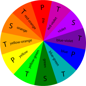
As shown here, the colour wheel has normally got 12 colours within it, and with these 12 colours can be used to make up the Primary Colours, the Secondary Colours and the Tertiary Colours.

The Primary Colours are the 3 pigment colours that cannot be formed by any combination of other colours:
Red
Blue
Yellow.

The Secondary Colours are the colours that are created when the primary colours have been mixed together:
Green
Orange
Violet.

The Tertiary Colours are the colours that are created when the primary and secondary colours are mixed together:
Red-orange
Red-violet
Blue-violet
Blue-green
Yellow-green
Yellow-orange.

As I have stated there are only 3 of the Primay colours and 3 Secondary colours however there are 6 Tertiary colours, due to as I have stated the tertiary colours are created via mixing the secondary and primary colours together, therefore creating a greater number of combinations.

Using the Colour Wheel we are also able to create colour swatches using different combinations of colours.

Complimentary: This means using 2 colours that are at opposites sides of the colour wheel, for example, Yellow and Violet.

Split Complimentary: This means using 3 colours, in a similar fashion to Complimentary, however there would be one colour on one side and then 2 colours from the compliment, for example Green, Red-orange and Red-violet.

Analogous: This means that 3 colours that sit next to each other on the colour wheel are using harmoniously, for example, Yellow-green, Green and Blue-green.

Monochromatic: This means that you would use one colour, however you would then using different shades of that one colour.

Achromatic: This means that there are no colours only using neutral shades/tones, for example Black and White.

Assignment 4 - Design for the Web - Brief

For this assignment I will research, design and build a website on an aspect of digital media design theory useful in the degree course. The target audience for this website is the other design students, so I should introduce the topics assuming no previous knowledge of the subject but I can take it beyond the basics. This is not a software skills website, it's about design principals.

During our first class with this brief we each decided which subject we would like to choose, the options were:
Typography
Colour
Composition
Drawing
Animation
Video Editing.

Due to my existing knowledge, also I would like to go into more depth with this choice, I decided to choose Colour as my subject.

Friday 15 January 2010

After the 'Crit' Session

During my 'Crit' session I had found that because I had finalised my work and made it look better in the end, I had quite good feedback, I had been told that my work seemed to reflect my chosen artist and everything seems to be linked by colour and image.
Therefore I am very happy with the products that I have produced, and I feel that I have used the time that I had to my advantage, and the previous feedback that I had, I then put to practice and in the end made my products better.

Wednesday 13 January 2010

Production Log for my Booklet

My booklet would actually contain my essay, and maybe a few image of the artist and his artwork.
I first made my character styles at which I was going to use in my essay, I also changed my paragraph styles. The character style determines what single selected letters would look like, and the paragraph styles would determine what the rest of the text would look like, and the rest of the text is called the body text.
Both of these icons look the same as do the windows when you open them. Each of these are found under Windows/Type & Tables. you can also find other icons there as well, in case you needed them.

I first thought that I wanted to link my work together so that I is almost all the same style, therefore I used the same technique as I did for the background of my leaflet, and the colours of my leaflet.
Therefore as you can see I have got the 3 shaded effect, and the colours of the type are the same as the front of the leaflet.
Also to keep the continuity of my work I also used the same image on the front of my booklet as I did for my leaflet.
I also wanted to to make the border of the lighter brown the same all of the way round therefore I changed the position of the darker brown sections to where I needed them to be.
On the inside where my text is going to be I have made it the same colour as the inside of my leaflet, also I have decreased the opacity to 50% so that is was only the background colour, and did not over power the text.
I first had to write the text into a word document, and then later add it to the InDesign document.
To add it I would first make sure that I had continued the text areas so the text would flow into the correct places, to do this I just clicked on the bottom square, on the edge of the text box and then click in the text box at which I wanted the text to flow. I would then go to File/Place and I would select the point of where my text would start. And then due to my previous actions the text should flow into the correct text boxes, and therefore when I would do a test print everything should read fluently.
I also changed the colour of the text to the same colour as the background of the outside of my booklet.
I also added my Character styles that I had previously created. The first one was to make very first letter bigger and thick then the body text.

Here another 2 pages of my booklet, I have also added another character style to the first letter of the brand new paragraphs, this was to make sure that each one would show that it is a different subject. I therefore did not make the style thicker I just made it taller then the body text.
And when it came to the paragraph style I just made sure that the size of the text was to how I wanted, which was 14 pt, and the colour was the same as the front background colour, also to carry on with the continuity of my work I kept the same font, Tohoma.

Due to some of the content in my essay I wanted to place an image that was relevant therefore I remembered mentioning about the Time Square Mural, at which I had found in the book on Alex Katz, and I thought that I wanted this image in the center of my booklet.
I first tried finding it on the Internet, and had no luck therefore I scanned the image into Photoshop and the cropped out the parts that I did not want, I then placed it into my area at which I had already marked out.
And then to allow me to carry on with the colour scheme I had thought that I would use the same colour background for my image as I have on the front of my booklet, I also made sure that the white borders at the top and bottom were continuous thought my booklet, therefore I had to see if they are in the correct position before I tried printing it out.
I then printed out a tester to see if my design would work, and thankfully it does, and this tester I will stick into my sketch book.

Production Log for my Face Poster

After a slight 'crit' session I then decided to create a third poster that would replace the Tree Poster. I first chose a design at which Katz had previous painted for the poster that I was going to digitally create.
Using the paint brush tool I first draw out the image, this would then allow me to fill in the spaces once point at a time, however in the final part I would not have any outlines or strokes.
I also adapted my other design for the poster itself, instead this time I will have a white border all of the way around the image in the middle, with the text above and below the image as like my Tree poster.


Here I am creating the left eye, which is no completely visable, I first used an art brush to create the paint brush stroke effect.
Then I drew in the eye lid in the same place as to where the original image is, I then tried to match the colour of the eye itself, also the white dot in the middle of the eye is not an error I had put it there because I was copying the original, and hopefully using the small details would make my poster stand out.
I then filled in the colour of his hair first with a base colour, as I assume the artist would have done. I then added strokes of different colours to give the hair some natural highlights that were shown in the original, some of the strokes I had changed the opacity to make them look more effective.
I also did a similar technique with the eye brows, this is because this would hopefully give my image some depth, by adding the shading that is in the original.

I then gave my face the base colour for the skin, and after showing it to my peers someone had mentioned that on the original there is some sort of shading all over the face.
I therefore chose to use the same effect as I did for the Building Poster and that technique is Gradient Mesh.
Now I had figured out how to use it, I thought it best to use it for this problem.
Therefore I had to experiment with different shades until I had found the right one for me, after that I then added the gradient mesh by pressing the 'u' key of the keyboard, selecting the points that I wanted to change the colour of and then selecting other points that I wanted to be the skin colour, and this gave me a shadowed effect.
I then used the gradient mesh on the other parts of the face as well, for example the eye, where on the original there was some shading around one of the eyes as shown here.
However due to the nature of the shadow, and due to the shape I had to experiment again with the colours until I achieved the right effect.
I also had to change the size and positioning of some of the point in the gradient mesh and to do that I had to first select the white arrow tool and then select the points I wanted to move, and then move them to the correct positions.
And for my shadow to work I had to make the mesh fairly big, and make sure it was under the eye itself.

Here I am showing the whole poster, that is because I had finished with all of the different sections of shadowing, and this is a way to see what I looked like all together.
I then showed my poster to my peers and tutors, and someone had mentioned that my border line looked like it shouldn't be there, so I had to make it thicker and more defined, also as the same as the Building Poster the date typography did not look professional, therefore to keep the designs the same and continuous I chose the same font as before, Helvetica.
And here is my final product, also it make the image itself stand out I also changed the white spacing in the image just off white, this was so it didn't blend in with the border.
I also changed the Kerning of the date text as well, just like the Building Poster, I did that because this would then make the poster look more professional, even though it is only a tiny detail if this is what I want to do, then I should be looking out for it.

Changes I have Made

When I took my work into college to show my peers and my tutors I then found that I had got many criticisms about my Tree Poster, that is because I first found that instead of looking like painted leaves someone had said that they looked like peanuts, and this wasn't the affect that I wanted to achieve.
Also someone had asked me why didn't I do a poster with a person on it, as that is what Katz is mostly famous for. I then decided that I was going to scrap the Tree Poster and start work on another poster that had a person or figure in it, and that will hopefully give me a better outcome then what the reactions were to my Tree Poster.

Production Log for my Building Poster

For my second idea I wanted to try and create a digital version of one of Katz's designs of a building, I chose this design because I thought that the colours were similar to my swatches that I had chosen, also I liked the way that Katz had made the image look 3 Dimensional, even though it was flat.

I begun with opening a document in Illustrator making sure that it was A3 and the colour mode was in CMYK (this was so I could print it out without there being any colour problems).
I then started with the background colour I had noticed in the original that the background colour was quite a darkish red, therefore I had chosen this colour.


I then added the building making sure that the colours were first complimentary to the background, so that I wouldn't clash, also make sure that the colours were almost the same as the original.

I used the rectangular tool to first create the main area and then the 2 chimneys on the top, to create the triangle on the side I used the star tool, and then pressed the downward arrow on the keyboard until the shape was a triangle (pressing the up or down arrows on the keyboard would increase or decrease the amount of points on the shape).
I then added the windows that were showing in the image, however I did not copy the original completely because I wanted to use it and make it my own, therefore I placed in more windows and placed them in different positions.

At first to make them stand out I made them white, and at first they had a black stroke around them at which I did not want therefore I got rid of the stroke.


I then put 2 television aerials on the top of the building and to make sure that they were not the same I draw them each separately using the line tool, and to create the dish on one of the aerials I used the circular tool.

By doing this, I was hoping that it would give my image a sense of realism like Katz's original.

I then added in the name of the artist and the years at which he worked. I thought to myself that I would like to make the name and dates stand out otherwise people would not know who I am supposed to be advertising, therefore I places a white box around the text, and this made it stand out.

Also putting a white box with the text in it, and then placing it in a corner I found it was of a similar style to the book at which was on Alex Katz.

I then took another look at the original and then compared it to my design. I had then found that the colours were too bold and the image was too flat and on the original the building seemed to have faded into the background on one side and the windows did not stand out as much as mine.
I therefore changed the colours so that I would suit the original more and hopefully make mine look better, I then used the colour swatch that I had chosen previously and then I used another colour for the windows.
To make the building blend into the background on one side I used a technique called Gradient Mesh. I first pressed 'U' on the keyboards and then I selected the points at which I wanted to change, I then selected other points and using the Ink dropper tool (i on the keyboard) I was able to choose the background colour, this then showed the building fading into the background on one side, like the original.
I also noticed that on the original that the windows that were placed on the outside of the building Katz had put them at an angle or in perspective, like they were on another building that you couldn't see, through the fog that was portrayed.
Therefore to create this effect I selected the windows that I wanted to give perspective to and I then I went to Effect/3D/Extrude and Bevel.
I would first make sure that the preview was checked so I could see what I was doing. I then changed the extrude depth to 0 pt so that the windows would not become 3D, I then started changing the Perspective of them.
I experimented with the different setting until I got the effect that I wanted.

I then noticed, as I have said before, there was a foggy effect on the original therefore to achieve the same effect I just made a box and filled it with a light grey, I then made sure that it was only over the image and not the text, then to allow the image to come through I decreased the opacity of the grey section to about 30% and this allowed me to achieve the foggy effect.

I then showed what I had done to a few people as well as my tutor and someone had suggested that I should make the background of the text box the same colour as the windows, because then it would fit in better with the poster, also someone else suggested about putting a white border around the whole thing, this was to make it look more professional.
And lastly, my tutor had mentioned that the typography for the date section, did not look professional therefore I changed it to another font, Helvetica, this looked better, and then using the Kerning section in the paragraph window I was able to make the space between the '-' and then 'P' a bit bigger so it would match the spacing between the '-' and the '7'.
After all of the different trial and errors I came across I finally came up with my final design, which is in the last screen grab.

Friday 8 January 2010

Production Log for my Tree Poster

First I had come up with a few sketches in my sketch book, this was so I could get an idea of what I wanted to do for my final designs. I decided on 2 designs from my sketch book that I thought were of the same style and techniques that Alex Katz used.
I first decided to try and create my own version of the tree paintings that Alex Katz had done, I first started with the trunk of the tree, I situated it in the middle because I felt that I would give the audience something to focus on, therefore I was making it the focus point.

I then created the branches, that came out of the trunk of the tree, here I used the line tool.
Then using an art brush I would create the leaves that in the original Katz had used his art brush to give a certain effect I therefore tried imitating this using an art brush in Illustrator. I first picked out the main colour, which her was a golden brown colour, this was to show the autumn leaves.


I then chose the next colour that I would use which was a darker brown this would show the leaves that were in the later stages of autumn, I also included some brown bits on the trunk this was to give a sens that the tree must have been quite old, maybe with some rot on it.

I then decreased the opacity of the leaves this is so I made the image look more like a painting.

I also used the font Tohoma, This was after my research I had concluded Tohoma was best for this particular artist and his time. Therefore to make the name stand out more I had made the name bigger then the other text and I had made it bold.
This design, with the text at the bottom and the top with the image filling the middle, I have found quite an interesting design at which is why I had chosen it to use for one of my poster designs.

Thursday 7 January 2010

Prodcution Log of my Leaflet

In this post I will be explaining how I have created my leaflet, and why I have chosen the ideas and the decisions that I had made. I had to decide what kind of leaflet I will want to create a template for, I had a choice of a tri-fold leaflet or a gateway leaflet. Due to what kind of effect I wanted to achieve I therefore decided to go for the gateway leaflet.

First I had to create a template to which I will have to work in, and this will help me to create my Gateway Leaflet.
I opened a new document in InDesign, making sure that first the Master Text Frame box was ticked, as previously advised, I then went about changing some of the default setting to the settings that I wanted. For example I wanted the page to be A4 and in the Landscape position, and once I had made all of the necessary changes I then had a basis at which to start building my template.
Then I used the rulers, which were to the left and on the top of the work area, to measure the right dimensions for where I will need to place my text box. And then using my Text tool I had placed the boxes in the same positions. And to make sure I knew what to put where I then labelled each of the sections.
For the front of my leaflet I wanted to place this image on the 2 sides so that when you put them together it would make the complete image and that will be in the center of my leaflet.
In this screengrab below, I am designing the front and back of my leaflet, I first tried to separate the Alex Katz image using Illustrator however, I was unsuccessful, I therefore decided to copy the image and place the 2 images at opposite sides, making sure that they are perfectly aligned. I then decided on the back I was going to put a small bit on information about the artist as well as a photograph of himself. I then tried printing the page out and folding it to make sure that the template and the design worked, and they did (I put the print outs into my sketch book to show my progress).


As I then knew that my leaflet design would work I then decided on colours for the inside and the front and back of my design. I wanted to carry on with a similar style to which Katz worked, therefore I went onto Kuler and found 3 different swatches of colours that I felt best went with Katz's style, I then chose a main colour swatch and this allowed me to have the 2 colour that I have used for my leaflet.
Here I am showing how I placed my colours, I first filled each of the 3 sections in with the same brown, I then decreased the opacity to about 50%, this is so it does not over power the writing and images. I then found because I had decreased everything in the boxes I had also decreased the opacity of the text as well, therefore I just copied the right sections and then paste in place, which then gave me a 3 toned effect when I printed it out for a test. I then moved the edged so that the white and the lighter brown was of similar widths, this was so that I looked better a
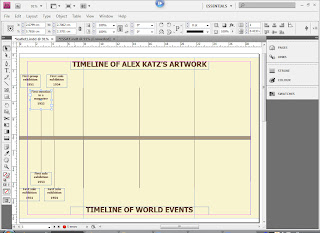
nd more orderly.
Once I had finished with the front and back, making sure that the finer parts were sorted, I then concentrated on the inside making sure that I had enough information to allow myself to create a quite filled timeline of Alex Kat'z work and life.
I got this information from his website http://www.alexkatz.com/ and on this website it a mini biography and a full biography, and this allowed me to get the information that I needed.


I then first went through all of the different exhibitions and parts of his life that I felt was quite substantial, I had to make sure that the choices that I made were relevant to the artist, also because Katz's had been having exhibitions since the 1950's to the present day there was a lot of information that I could have used, But I made sure also that I had chosen parts of his life and work from every decade. This was to show that he has been around constantly.
I then decided to show what was going on at the same time in the rest of the world, this was to see if there were at any point a time or place that influenced Katz at all, and if not then it would just show what Katz had to work through.
The information that I used I had got from one particular website, at which I had found through Google search, after putting in world events and then a year, www.historycentral.com/Europe/Index.htlm, there were a few coincidences that I have found for example in 1989 Katz had an exhibition in West Germany and in the same year was when the Berlin Wall came down.

After looking through the 2 different timelines, I feel that the world events really didn't have any affect on Katz's work because as I look through there were no really changes to his style, therefore it shows that he is consistant in his work even through difficult times.

Swatches for my designs

I went onto Kuler and after looking through and comparing different swatches to Alex Katz's work I have found 3 strong swatches that I feel co insides with his style of work.
I first notices that Alex Katz mainly using natural colours, this seems to be because he is mainly using real people as models to create his artwork, however there are some that are quite bold, and this is where Ktaz want to make an affect on the people who see them.

The first swatch is called Copy of Natural Path, I like this swatch mainly because there are natural colours that match some of Katz's work, and therefore it would be easier for me to use them to link with Alex Katz.


The next swatch is called Katz, this is because I was trying to see if Alex Katz had any swatches, and the way I came up with this one was by typing Katz into the search engine.
I feel again that this one can be used to represent Katz's work, this is because it uses natural colours and quite bold colours at the same time. However, I feel that compared with the first one I don't think that it is as closely matched to Katz's artwork.


And lastly the swatch is called Alex Ross Warms, again to get this swatch I used a similar technique as before, however this time I typed in Alex, I think that this one is not as good as the 2 before however I do like the colours within, but I won't be choosing this one as it doesn't really represent Alex Katz fully.
After looking at these three swatches carefully against Katz's work I have found that the first one, Copy of Natural Path, was the best and the one that I am going to use for my project, using one swatch will hopefully link all of my components together as well as showing consistency throughout my work.

Monday 4 January 2010

Production Log for Postcards

I first started designing my postcards in my sketch book, using mini drawings and quickly sketching out different things I was able to come up with many different ideas for what I wanted to do for my postcards. Once I had decided on the ideas I then created them in Illustrator, and here is how I did them.

First I looked back to the example of postcards that I had collected, and then to get the size of
my postcards the same, I decided to measure the existing postcards and that is how I got the size for my postcards.
And as you can see here I have made one and then I had copied it 3 times to make the bases of my 4 postcards.

To start my first postcard I had to choose the correct colour that matched my designs, (and before all of that I had to make
sure that the colour mode was CMYK, as I will be printing these out).
In this screen grab I show the percentages at which I have made my colours, using the CMYK, but to get to that stage I had to experiment with different percentages to see if I could get a colour that was either the same or similar to the design at which I had done in my sketch book.

Here I have chosen the background colour, and using my designs from my sketch book I was able to place the black stripes in the correct places, and then I chose the right colour for the blue section, I thought to myself for the blue I had to chose a shade of blue that wasn't to bright
however it needed to stand out, which is how I came to choose this shade. I then did the same for the red colour that I had at the top of the postcard.
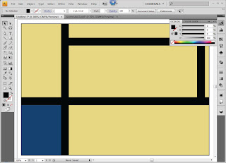
The second one I had to start with the blue as the background, and with this design I wanted to make it quite bold, but not to bright. I then used the pen tool to make my yellow section and the way I made the edges curve was by using another tool, which was part of the pen tool section, this is the curve tool, I then repeated the action with the green section.
The way I determined the colours was to first look back at my design to see what sort of colours I used, and then using my sketch book as a reference I was able to pick out my colours through experimenting and eliminating the shades or colours that I did not want to use or I did not think was right for this one postcard design.
Here I took a screen grab of the third postcard that I had designed. The design came from one of Alex Katz's collages that he had created.
How I did this one, was by first deciding on the background colour of my postcard, and then adding all of the different shapes that I had designed in my sketch book. I also made sure that each of my shapes had no fill and a black stroke/outline, this was so I could place them in the correct places and then fill them in once they were are placed and in the right order, and because I had used only a minimal amount of colours I was able to change them in groups by clicking on one and then holding down the shift key to select more at the same time.
Using my finished sketches in my sketch book, I then used the white arrow tool to manipulate so of the objects, this is so that it was look like my designs. The way I manipulated them by using the white arrow tool, was to select the points at which I wanted to change and the either dragging them to a certain place or even deleting them if they were not needed.
As you can see here I have filled in all of my objects and I have taken away the stroke. Moreover I have looked again at my sketches and I found that I used a darker tone on the bottom then the top, hence the change fat the bottom.
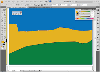
Here is the last postcard design, and with this one I wanted to use my knowledge of colours to help me determine what colours I used.This one was a bit different to my sketch book design because with my sketches I had basically copied Katz's work, and what I wanted to achieve was an understanding of his work and therefore I had changed my design from flowers to leaves, however keeping with the same ideas.
Using my knowledge of colours I thought to myself as leaves are green I will use the opposite colour on the colour wheel to make them stand out, which therefore allowed me to make a decision on the background colour being red.
In this screengrab I had already drawn a leaf, then I had copied it many times, and then manipulating them to make them each look different.
To create the effect of the leaves going off the page I had first placed some of the leaves over the edge I then, using the line tool, placed a line on the edge of the postcard, I then went to Object/Path/Devide Objects Below, this then allowed me to delete the excess parts of the leaves that I did not want, and this allowed me to achieve the effect that I wanted.
In this last screengrab I have shown each of my postcards, and these are all different takes of Alex Katz's work, I wanted to show that I understood the way at which he worked, and the way he used colour to create his designs.