Tuesday, 24 November 2009

ASSIGNMENT 3: Design Time Capsule - Research

With this project I have to come up with an idea of either an artist or art movement at which I will have to base a Time Capsual on. Within the Time Capsual I have to create postcards, A3 posters, a leaflet about the artist or art movement and an A5 booklet again about the artist or art movement.
There are different art movements that I am interested in to researching and basing my project on. They are Art Nouveau and Pop Art.
Here is some research about my chosen subjects and this should help me decide on which movement I would base my project on.

Art Nouveau:
Art nouveau first came about in the 19th century (1880), and the popularity of the movement peaked at the turn of the 20th century (1890-1905). The name Art Nouveau is french for 'New Art' however this wasn't the origins of the name, each country had a different name for the movement, for example Jugendstil was the name for it in Germany, and this stood for 'Youth Style, and this was based on a German magazine called Jugend, and this magazine promoted the movement. Another name for it was Stile Liberty, this originated from Italy, and this was based on a department store in London called Liberty & Co, this was because this store popularised the art style.
The style of Art Nouveau is characterised by organic, especially floral or other plant-based designs. Therefore the style of Art Nouveau flows and is quite contemporary, and some artists have even placed the movement into everyday life into furniture and architecture.

Some of the artists that have been part of Art Nouveau are:
Alphonse Mucha:
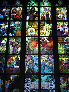
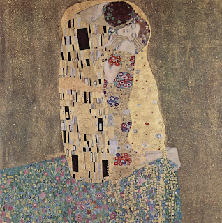
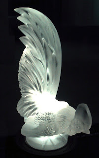
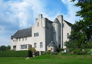
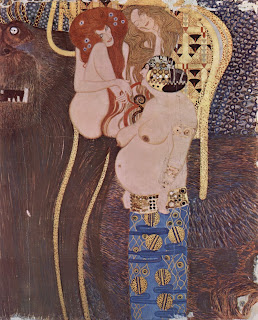
Gustav Klimt:Rene Lalique:Charles Rennie Mackintosh:


Pop Art:
Pop art first came about in the mid 1950's in Britain and in the late 1950's in the USA. Pop Art is a visual art movement. Pop art is mostly characterised by the popular mass culture for example comic books and advertising. Pop art was a continuation of certain aspects of Abstract Expressionism such as the large-scale artwork.
Even though Pop Art had taken off in both North America and Great Britain the origins had developed differently. However there were some similarities for example they both employed Irony and Parody, however North America they were used to defuse the personal symbolism and in Britain they were more academic with a focus on the dynamic and paradoxical imagery of American popular culture.
Here are some examples of different Pop Artists:

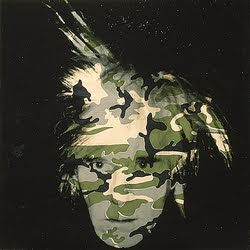
Andy Warhol:

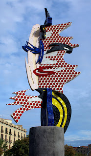
Roy Lichtenstein:
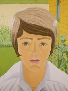
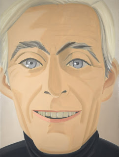
Alex Katz:
Wayne Thiebaud:

Friday, 20 November 2009

After the 'Crit' Session

During my 'Crit' session I had many various comments both good comments and comments saying about things that I need to work on.
On the front of my box, I got told that the typography of my company name was too old fashioned and it didn't work with my theme, therefore I had changed the font so it matched the theme and the whole affect. Also with the front I was told that nothing really worked together and I needed something to bring the character and the text together, therefore I had previously on the back of my box a tree that I had used for my maze so I copied it across, then changed the stroke to make it thicker, and then placed everything around it to that everything then worked together.
The comments were generally good for the sides however, the typography of the turner's needed changing, and then the small squirrel almost faded into the background and therefore I had made the character lighter so that it stood out from the background.
Also for the sides, I had another comment to get rid of the stroke on the 'Cyril the Squirrel' text, therefore I did an it stood out better then with the stroke.
Lastly, I had another comment that said about the spacing of my 'Cyril the Squirrel' text, and therefore I had changed that, as well as I needed to make the text thicker to show off the lines more.
All in all once I had changed the points that I had comments on, I feel that my box is a good representation of a standard on the shelf biscuit box.

My final Design

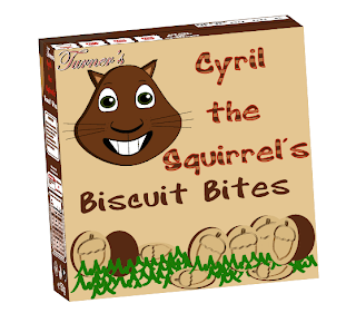
Here is my final 3D version of my box, this version I have developed throughout the whole of my project.
I have made the 3D version by using Illustrator, I first make all of my sides as a symbol, I then create new document, then I make a box using the rectangle tool, making sure it is the same size as my front of the box, and then make the fill colour the same as the background of the front of my box, also make sure that the stroke has been turned off.
Then I select it and go to Effect/3D/Extrude and Bevel, I then make the depth of my box the same size as the width of one of the sides of my box.
Then I go to Map Art, making sure that the Preview has been selected, I then go to each side and select the correct part for the correct section, I then press OK and the box is then covered with each of the sides that I had previously created.

Thursday, 19 November 2009

Changes I have Made

At first I had finished my box on Tuesday 17th November, and I had people say what they thought about it. Also Kate had given her opinion to what is good and what thing might need changing before handing everything in on th 20th November. I took everything on board that both my peers and what Kate had said.

On the front of my box, to start with someone had pointed out that the 'Turner's' logo was the same font as the product name, I then thought about that and I went back to my research and I had found that the company name was always a different font to the product name and therefore I had to change it. Moreover, I had noticed on another package that normally with a token collecting game the tokens are normally on the top of the package, where they are able to be torn off easily, and therefore I moved them.

I then had an empty space at the bottom of the front, and I had to some how fill it. After going through my research again I had found that I had never shown what my product looked like on the box, and therefore I created 1 biscuit and then copied it and manipulated a few of them, I also added some grass to make them tie in with the whole theme of my package.
And here is my finsihed front, with the appropriate changes that I had made to make my box look as professional as possible.
On the back, I had good comments about the maze that I had created, however, I did have some comments about why is the company name not on the back of the box, therefore I used that information to then change the 1 thing that needed changing.
On each of the sides, I had seemed to get good feedback, especially about my nutritional section, however, again people questioned why the company name was not on the sides of the box, and therefore I had to add it to them. Also I had a comment about the name of the character and how the stripes, when scaled down, made the text look too busy and therfore to make the name look less busy I changes the white parts of the text to the same colour as the other parts of the text, making the text all one colour, and I did this on both sides.

With the bottom, I had good feedback and I got told that I didn't need to change anything as it was simple enough and didn't need anything else.

For the top, due to the comment about the front I moved the tokens from the fron to the top and thus making me switch a few thing around. to allow me to fit the tokens in I had to move the best before part to the opposite corner, then this allowed me to fit in the tokens, at which having the tokens there will make it easier for either the children or the parents to tear off.
Each of the changes that I have made to my box I feel has made my box look more professional and all in all I feel that I have produced a good product for this project.

Progression on my Box

I first had to decide on a theme, and first I thought about doing something similar to Milk Chews (these are a calcium based sweet for children), however, I had come up with too many problems also there was nothing to base my idea on and therefore could not be compared against anything. I then came up with an idea of doing chocolate covered biscuits, I knew first that there were example for me to compare my work to and it would be more likely to sell as a product.

Now that I had my theme I then had to decide on a name, previous to this I had already thought about names for my character, (as in my research I have found that most characters on box have some sort of name), the name I had chosen was Cyril, and just to make things clear to the customer I then added Cyril the Squirrel, I came up with Biscuits Bites whilst playing about with ideas in my sketch book.

I also made my mind up that I wanted on my packaging some sort of collecting game that will entice the children to buy other packets. And on the bottom of the front of my box is where I first placed it. Also due to lack of space on the front I decided to put the instruction of the game on one of the sides. I then had to create another version of my character, which faced side ways, the way I did that was to use the image that I previously used for the colouring and then trace over it using the paint brush tool.
To make sure that I could use the characters over again and scale them without changing the stroke size I had to make them symbols, to do that I had to drag the whole image into the symbols bar (as shown here) and then type any name and then make sure the Movie Clip bit is selected and then press OK. If I wanted to change anything on the symbols I just double click them whilst they are in the symbols palette.
On the back of my box I had found a distinct pattern with the other boxes that I had done for my research and that is that each of them had some sort of game for the children to play. There were ideas like spot the different, mazes, cut outs and colour things in, after thinking about in I wanted to create a maze.

I chose the maze because I felt that I could do more with it to incorporate it in with my theme, as you can see here I had made a tree maze, this is because squirrels climb trees and then at the end of the maze is a bunch of nuts for the squirrel.
I then thought abou the colours of the maze and how they should incorporate with the design, therefore I made the parts of the maze in the trunk of the tree the same colour as the trunk, and then where the maze enters the green section of the tree the maze would turn green, this coul give the effect of the squirrels' journey up the tree.

This is the image that I had found using google for the tree of my maze.

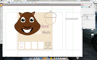
Here is a screen shot that I had taken, every side of the box has something on it even though it is not finished. On one side I have got the instructions for my collection game, the address of the place that the children need to send the tokens to, the name of the product and the side version of the character.
On the back I have got the name of the product the maze (at which is half finished), the character (indicating where the children should start the maze), and a giant acorn, which spread around 2 other sides, this joins the sides together better.
On the other side at the moment there is only a bar code (that I had made) the name of the product and one part of the giant acorn that is on the back.
On the bottom there are terms and conditions of the collecting game that the parents must be aware of, as well as a website for the parents to go on for full terms and conditions.
Lastly, on the top is an expirey date, at which I had copied the style off of a previous box that I had used for ym research, and the top of the giant acorn from the back of the box.
This was the original Best before design that I had come up with using other packaging, however for my design it wasn't the right 1 to use, and therefore I had changed it to one that is similar to the 1 off of
a packaging that had a similar product as me.
The new design is a white background with the date and some other numbers and letters that were also on the other boxes, also the type is not perfectly straight.

On the other side of my packet I am going to do the Nutritional Information that is commonly seen on packaging. Here I am using a box that I had previous looked at in my sketch book to design the information in the style that is mostly used.
I had created the columns by first using the rectangular tool and drawing out 1 long thin line, this will divide up the columns, I then hold down ALT and SHIFT and then place 2 other lines in the appropriate places.
Then to create the lines going down, I first create 1 box at the top and the create a copy and place it directly underneath the first box, I then click on Object/Blend/Make (Tiger Stripes technique), this is to make the lines that will have the information within them. Once I had finished expanding and ungrouping the lines I then create 5 different boxes all with different shade of brown in them, this is so I can use the Ink dropper tool for the different lines in the table. Lastly I then decrease the opacity of the lines to about 80% and make sure the thin lines are in front of the thick lines.
Once everything is sorted out I then add all of the relevant information that is needing to go in the correct places in the graph.
Above that is the Allergy Advice, which allows parents, who are buying the biscuits for their children, to see clearly what specific things they need to look out for, if their child has an allergy of any kind.
Again above that I where people can find the expirey date and they can also see how they should store the product.
And then lastly I have placed the Ingredients at the top this is because the ingredients can be one of the most important things on a package of a product, because if people have specific allergies that they need to look out for then the ingredients should list everything that is in the product, it should also be clearly written so people are able to understand it as well.

Making the Character (Part 2)

I then decided once looking at my character on the background of the front of my box, I had found that it wasn't working, and something needed to be done to make him stand out. Therefore, I thought that I could had a drop shadow to him, which will hopefully give the character more depth and this will make him stand out.
The way I did the drop shadow was first by selecting the object at which I want the drop shadow to be attached to, and in this case I want the drop shadow on the character. And as indicated here, in the screen grab to the left, I am able to see that the character is selected by the fact of the outlines of the character are a shade of blue.
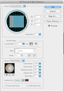
Once the character is selected I then go to the options at the top, then click on Effect/3D/Extrude & Bevel, this will then give me this window here on the right, this allows me to create the drop shadow and make it however big or small I want, as well as change the colour of the shadow, this will allow my character to look better then if it had a black drop shadow.
Once I have decided on the depth, colour and positioning of the shadow, I then click OK, which will then make the drop shadow on my object permanent.

Tuesday, 17 November 2009

Making the Character

For my project I have decided to make a box for chocolate biscuits, and my target audience is Children between the ages of 4 and 10 years old, or even Parents buying for their children. Therefore, after researching other brands I have found that I would need a character on my box representing the product. I had then decided that because of the nature of children liking cute, furry animals I thought that I would use an animal that hasn't been used before in this area of packaging and that is a squirrel.

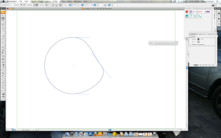
I begin by first drawing out a simple circle, and the way to keep the circle in proportion is by holding down the shift key whilst drawing the circle.

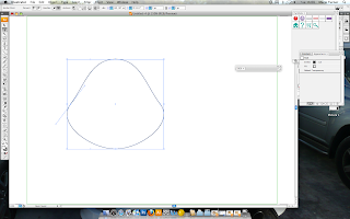
I then select the white arrow tool, this allows me to either move or manipulate different points of an object, for the character that I am wanting to create I will need to manipulate only 2 points, this is to make the cheeks of the squirrel, because generally squirrels have big cheeks to store nuts, also in cartoons those sort of aspects are exaggerated. I select the point that I would like to manipulate first, and as it is a circle already there are other points that allow the curved edges, I drag one of the points inwards towards the center of the circle, until I feel that the size of the cheek is enough, I then repeat the same process for the other side of the face.
And here on the right is a screen grab of what the circle is like after I had manipulated the points, as you can see I have now got a template for my squirrel.
Once I had done the base I then had to create the facial features of the squirrel. After the research that I had done, I found that I had to make my character happy and friendly, without being too over the top.
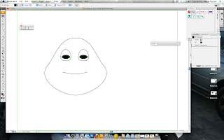
I started with the eyes, I first made 1 oval shape, I then used the white arrow tool to make the bottom of the eyes straighter, also this can help the character look friendly. I then held down the ALT and SHIFT keys together whilst the eye was selected, and the dragged it across so it was at a similar distance from the other side of the face (holding down ALT copies the selected image or object and holding down SHIFT makes the path of where the image was to where it is going in a straight line).
To make the nose I used the arc tool so there was a slight curve, and then I can draw on the small bits on the end of the lines to make the nose look better. I then made my characters' mouth, and for my character to be friendly looking I had to make a smilely mouth. The mouth was very simple because I just used the paint brush tool and draw the mouth by hand, and then to make the teeth I just used the line tool.

On the right, you see my character with the facial features in place as well as the ears and whiskers.

The way I got the colour for my character was by using an image of a real squirrel and then in Adobe Photoshop, pixilate the image and then open in in Illustrator and the use the Ink Dropper tool and use 1 of the colours from that image.
And here is the pixilated image of the squirrel that I used.

Sunday, 1 November 2009

Progression on Ideas

After doing a lot of extensive research into the different types of boxes and their target audiences I have decided to focus my attention on children/parents buying for children. This is because I feel that I am able to be more flamboyant and creative when designing something for children.
During class I had been thinking of a few ideas and so I thought that I would try them out and see what they would look like.

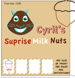
Here I have created the front, and part of the side of a box. I had used the technique that I had already explained about with the name of the character. Looking at other packages I had realised that if I had created a collecting game for the children then they might be more inclined to buy more. This is because if they collect 4 nuts then they would be able to get a free toy or something along those lines, and here I have placed one already on the box, this can make them feel like they have got something already.

I was also trying to stay with the earth colours because they are more linked with squirrels and my character is a squirrel. Also I was wanting to have a nut go around the box, so that there was a sense of continuation.

I then thought about changing the colours to see if something else would work better. Here I have chosen a light blue, and after looking at it I thought that blue wasn't the right colour to create the effect that I wanted.
I had then tried light green, as I have shown in the screen grab on the left, however again I had thought after looking at it, that it wasn't again the correct colour for what I wanted to achieve at the end.
Therefore I thought that my original colour was the best as it was able to compliment the colours that I had used for the text and my character.

My Technique Progress

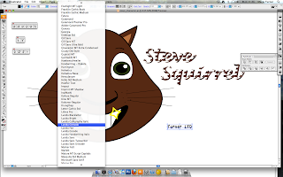
First I will be demonstrating how I created the striped effect on the text. This effect I will be using within my design.

First I have to decide on the text that I want to use, and that would be best for the design. I would then type out the words that I would like to use, and I would have to make sure they were correct as I would not be able to change them later on.

Next I would have to change the text from standard type to outlines that can be manipulated and changed to how I want, this application is called Create outlines.

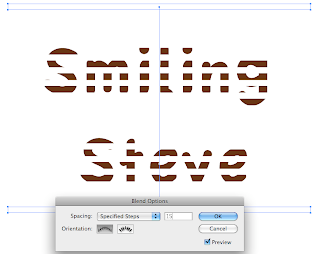
Here I am showing what that particular tool does, as you can see around the text 'Smiling Steve' there are small blue lines, this indicates that the words are no longer text that can be changed but they are now images that can be manipulated easily.

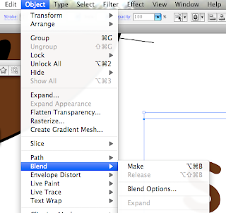
Now to create the lines that will be part of the overall effect, I first have to make a rectangle above the text, and then whilst holding down ALT, I then click and drag the rectangle until it is below the text (holding down ALT creates a duplicate of the original object). Then whilst both objects are selected I make sure that they are aligned, by using the alignment tools. Again, whilst they are both selected I then go to Object/Blend/Make, as I am demonstrating in this screen grab.

This tool will then allow me to see this, and what this tool does is between the 2 objects that were originally selected it has made copies of the rectangles until the area between the originals is filled. And therefore I am unable to see the text that is below it, because there are so many copies.
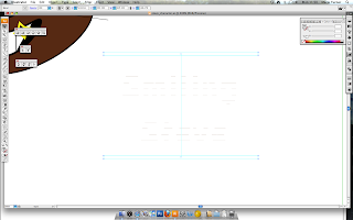
The way to reduce the amount of rectangles is to find the blend tool on the tools bar, double click on it, and then you will get a small option panel, as shown here at the bottom, and where it states 'Spacing:' make sure that it is on 'Specific Steps' this way you are able to change the amount of rectangel to however many you would like in your design.
And her I have chosen 15 steps because after looking at other amount I found that 15 steps was best for my design.
To allow myself to manipulate the rectangles indiviually I have to 'Expand' them and the way I do this is to go to Object/Blend/Expand, this then makes each one seperate, and then I have to Ungroup them and the way I can do this is by using the keyboard shortcut Control/Shift/G for a PC or Apple/Shift/G for a Mac.

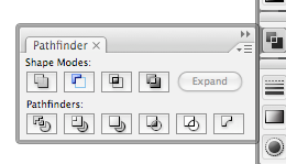
Once I have Ungrouped everything, I then go to Windows/Pathfinder, and then I will get this window pop up, and the tool that I would need to break up everything is the bottom left tool, which is 'Divide', but before I do that I make sure that everything that I want to manipulate is selected, I can do this by a keyboard shortcut, which is Control/A for a PC or Apple/A for a Mac.
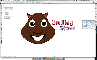
Here once I have divided everything I then delete all of the parts that I do not need, and that would leave me with just the text that is covered in lines. I then copy all of the text and to paste the copied text behind the original text I can use another keyboard shortcut which is Control/B for a PC or Apple/B for a Mac. Then I use the Pathfinder tool again, however this time I will be combinding them, this tool is located top left of the panel, and then I chande the fill colour to something that I appropriate.

After that, with the text still copied, I then have to paste one in front, this will allow me to make an outline. To do this I can use the keyboard shortcut Control/F or Apple/F. And again I use the combined tool on the Pathfinder panel to combined everything together and then I make sure that the fill colour has nothing in it and then I choose another colour, that is appropriate, in this case red and I put that in the stroke section.
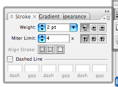
Here I am showing that using this panel I am able to change the width of the stroke to however wide I feel that will make the text show up even more.

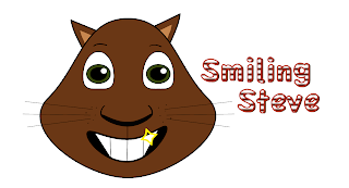
And here I am showing the final image that I had create using this technique at which I had previously learnt in another class.
For my project I think that this technique is appropriate because my target audience is children/parents buying for children, and therefore I feel that this a fun way to show the name of the character or products and will hopefully attract the children to buy it.