Here is a screen grab of what the site looks like, as you can see it is very colourful and bright this is because the target audience is very young and like this sort of website that can keep them interested.
I had taken a screen grab of the story page, where they put all of their animations to show to the audience. Here they have a more extensive range of animations to what we have been told to create, therefore they are able to had different pages to show them. For example they have an A-Z section so the audience are able to look through all of the stories in alphabetical order. They also have a section called Our Picks this part shows what stories the creators would recommend the viewer to watch.
All in all I like the style of the site, however I feel for the brief at which we have been set, having those sorts of colours probably will not fit in with the theme, therefore I will be coosing different, less bright colours for my interface. As a reference though this site is good to look at because it is very popluar with the my target audience, which is 5-7 year olds, therefore I can use this to make my website better and more pleasing to the eye, as well as make the audience more engaged with my site.


 Once I clicked on the word validate, I had found that within my code I had got 9 Errors and 1 Warning, (Errors means that you must fix the problem and Warnings means that they advise you to fix the problem).


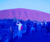 This is an image of Ayres Rock that I had taken about 5 years ago, I chose this image because of the heat that the place has and what I want to achieve at the end.


 And the one that I changed to was:
 I had place a background colour to this so it would be able to fit in with the background colour of my page. Also due to the colours being gradient I had to save it as a Jpeg, and unfortunately Jpeg's do not allow for the background to be transparent therefore I had to place the background in, in order for the heading to match the background of the page.
 Each of these have been made different to show the different variables that I could have.
 At first I used my first idea for the buttons and then I changed them to the second idea.
 This is where I found out that my button size was too big and therefore I had to change the size of them to fit my site.

 This was my final idea, and the feedback that I got from it wasn't very good, this is because the buttons were too big, also I got told that there are no websites with the buttons on both sides of the page, the text in the middle should be left aligned, the heading should not have a shadow.
 Here I have taken into account everything that was said about my mock-ups, and I have changed the elements that needed changing and I have got a good website that works well for what I wanted.