Tuesday 20 October 2009

Target audience

With the packaging industry there are many different target audiences or target groups that maerketing companies aim at. Some of the target audiences are:
  • Children
  • Adults
  • Teenagers/Young adults
  • Parents buying for their children
  • Old aged Pensioners etc...

Every company before they even start designing everything have to decide on their target audience to whom they would want to market their product to. They would then have to research their chosen target audience, so that the marketing would be attracting the right sort of people.

For example, when looking at marketing tools for attracting children, most packaging has got more bright and bold colours that will attract their attention straight away. Also with children I have noticed with my research that 75% of products advertised for children have some sort of character, whether they are animals or people. This I feel that the marketers may have realised that children can relate food or soaps to their favourite characters on television and therefore they are more inclined to buy it, instead of having just a simple plain box with writing on it.

Tuesday 13 October 2009

ASSIGNMENT 2: Packaging Yourself: Research

There are many types of brands that use boxes to package their products in.
For example:
  • Cereal
  • Soap/Detergents
  • Chocolates/Sweets
  • Games
  • Tissues
These are the types of products that are mainly used in every day life by many different people, and in this assignment I will have to choose a area at which I will have to create a box that one of the products should be able to go into.

Eamples of the brands that use boxes are:
Cereal:
Here I am showing 4 different brands of cereals.

Each of these are targeted for different types of people, for example the Honey Loops are mostly targeted towards children, especially as it has got a cartoon character as a representative for it. The Country Crisp are mainly for people who would like a healthier type of cereal as it has got fiber and other things in it as well. The Nutri-Grain Cereal Bars are for people mainly who are constantly on the go or don not have time to have a bowl of cereal in the morning. And lastly the Corn Flakes have a wider range of people and ages, this is because there is a character, however it is more sophisticated then a general cartoon character that is normally used to attract young children.
Chocolates:
Here I have put together different types of chocolate boxes, except not all of them are branded.

Each of these are using different colours to create what they want to achieve, however, each of them has a base colours at which they have worked around. Generally, a box of chocolates are for young adults and adults, this is because they are bought mainly for romance and apologies, and therefore they each have a sophisticated look to them.
Games:
Here again I am showing different types of boxes that you are able to see when you buy different games. I find normally for a board game, for each side is the name of the game and a different image of what the game is about or what is inside the box.
However, with video games for Play Station (1, 2 or 3), Game Cube, WII box etc... they have the main image and the writing on the front of the box, and then the logo of the type of console, at which the game can be play on, and the name of the game on the side, and then the story line (if there is one) and the details on the back.
Soaps:
In this image, to the right, I have 4 different brands of detergents that people are able to use to either wash their clothes or dishes.
Each of them have one common thing that is able to link them together and that is the colour blue, each of them some where as that colour within the image or the background. I think this is because they are for washing things with and to wash things with they each need water to work, and water is generalized to be blue.
Again, each of them have bright colours, I think that this could be because as they are revels to each other they are each trying to stand out, and the way to do that is to use bright colours and then they do not blend into the background.
Tissues:
Here, I am showing four different types of tissue boxes that can be bought from many different places.
The only one that is commonly known is Kleenex, however, each box is different and people do not always buy tissues by a label.
Generally tissue boxes have light colours, and not too many bold colours, this maybe because the companies that produce them want the customer to feel like that are contemporary and soft to the touch. Also some people would buy tissues due to their pricing, and this could again reflect on the look of the box, therefore if there is not a brand name and the box is quite subtle qith use of stander primary (or light) colours, then people may think that it may not have a big price tag and therefore they are more intent on buying that particular brand.

Friday 9 October 2009

After the 'Crit' Session

After I had my 'Crit' I have found that some of the things that I had to work on and things that worked very effectively.
A couple of things that I had got to sort out is first on the Jack and Jill QTVR there unfortunately was a line at the beginning of my panorama, also where I have tried to stitch the ends together, unfortunately one each was lighter then the other and the only way I could try and sort that out was to blend it in, however I was no able to blend it in fully, and people were able to spot it.
The thing that worked was the horizon line in the background, at which I was able to line up with no problems.
With the Train Station QTVR as I went round people noticed that the car and the building was stretched , which unfortunately I could not avoid as I was mainly trying to match up the where the edge of the bridge was. Moveover, I found that because I had taken some of my photos towards the sun, some of colours and the tones were off, at which I had tried to fix as best as I could, and luckily most places worked, but there were other places that didn't.
The things that got commented on that worked was the trains that I got working very well and people thought that it was very effective.
Lastly with the Band Stand I had mainly good comments on that especially with the railing, where I was able to line them up even though it was hard, but the hard work ended up paying off. Also where I was able to pull of the looking up the town, where it has the Martlets sign, I had quite a lot of trouble with the lighting and the sky being the same, but again with the persistence that I had, I was able to again pull it off.

Problems The I Had.

Unfortunately I had a few problems with my last QTVR. I had done everything that I had needed to do to make it, and it all looked fine in photoshop when I had saved it for the web, however when I came to putting it into Stitcher that is when I found the issues.

As I have shown here when the panorama was in Stitcher it became very pixelated and out of focused, at first I thought that the resolution was not at the correct size, therefore I went back into photoshop and had a look. There is where I found that the resolution was fine, but it was the image size that was wrong.

Some how during the course of when I was putting my images together I must of made the image size too small, which would have explained why the QTVR was so pixelated, because if the image is too small then when I had put it into Stitcher, it must have had to make the image bigger to fit (and what I knew was that you can shrink a big image but you cannot enlarge a small image).
Therefore, the only way for me to make the panorama the sam quality as the other 2 was to start from the beginning.

When I had finidhed doing everything again, and I went to redo my panorama, I found as I was looking through it that this occured, and this means that I did not overlap the images and make sure that they fitted properly, this meant I had to go back into Photoshop and overlap them.


I then had come up with another problem, luckily I knew what I needed to do to stop this white line from reoccuring.
What I needed to do to get my desired result, was to crop the image so that the excess parts of the flattened image would show, like in this screen shot to left.

And therefore I went back into Photoshop once more to do that and finally I was able to create the final QTVR, at which I had worked so hard and over come many problems to achieve.

Moreover, I had taken a forth set of photos that I did want to put together, and i had started them, however, as I am showing here it was to difficult for me to do and I had found that it I had spent more time on this then I would not have had time to do the other panoramas.

Tuesday 6 October 2009

Panorama 3 (Burgess Hill Train Station)

Again to start with I had to open the images one at a time and copy and paste them into a new document. Once I have done that I then sort out the images so that they are in order for when I come to stitch them together and make them into one single flattened image.
Once I had placed all of the photos in the correct order then this is what I would see, a long line of images ready to be stitched together to make the panorama image.


Here I am using different techniques to allow me to stitch the images successfully together.
First I would decrease the opacity to 50% of one of the images and then overlap the images by aligning a part of the images that would be in the middle of the photos.


Next, to blend the images so that there is no indication of the images being overlapped and so that I am able to give the illusion that the panorama is one complete image, I have to use a non destructive way blend them and the way that I had chosen was using layer masks and a soft paint brush.

With this panorama, I thought that I would be quite effective if I was able to put in 2 moving trains, luckily one point when I was taking the photos, I was able to take about 15 photos of 2 trains overlapping each other and then I was able to put them in the image, so that it would hopefully give the panorama a sense of movement.

Also with this one I was able to not have to use the Levels option, this is because I was able to only use the layer masks and the paint brush tool to easily blend the images together.
After repeating myself again, I was able to create my final QTVR for my project.

Panorama 2 (Burgess Hill Band Stand)

The process with this one is similar to my first panorama, however because of the colour changes in each of the photos I had to use the Levels palette to try and make the photos thet same, which will make them easier to blend.

I found that because of the lines fron the path and the railings this one was the hardest to put together.

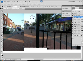
First I would lay out all of the images that I intend to use in a new document, like my first panorama, and then overlap them by decreasing and increasing the opacity of each image.

I would again have to crop out the excess space at which I would not need and then reduce the size of the image to at least 12000 pixels.

Then I would have to use Free Transform to allow the images, especially the lines in the pavement and the bandstand railings. The only way at which I could use the Free Transform in an effective way is by holing down the Control button (on both an Apple Mac and PC) and then manipulating each corner at one time.
I repeated this process for each of the images so that they would all line up, and that would make it easier for me to blend each of them in.

However I found that because I had taken some of my photos towards the sun, the colours were not all of the same and therefore I had to use another non destructive way of changing each single images so that all matched.

To get the images to that the brightness or darkness matched I had to use the Levels palette, like I have mentioned before. I first click on the layer at which I want the levels to effect and then click on the levels option, and then I was able to move the small arrows to make the image darker and lighter.

However, so that it doesn't effect the rest of the picture I have to click on the levels at which I had jus
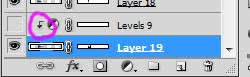
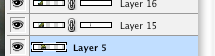
t put in and then hold down Alt (on both an Apple Mac and a PC) and click between the levels and the layer and which you want it to effect, and you will end up with this symbol that is circled to the left of the image.


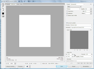
Once I had gone through each image and repeating the same process for each image until it was a seemless picture I would flatten it and then again save it for the web. Saving for the web allows me to decide on what the quality I want the image to be and whether I would like it as a JPEG, GIF or anything else, however in this case I have saved the flattened image as a JPEG.


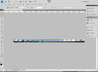
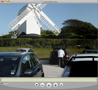
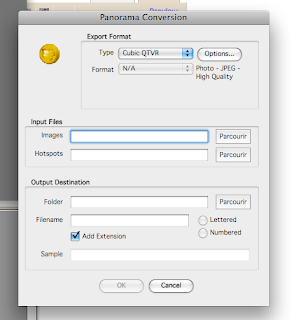
Lastly, once I have gone through the same process like the first panorama, by opening the .jpg image in stitcher I was able to achieve a .mov of the Band Stand that is situated in Burgess Hill town center.
And here I am showing the finished product as a still image.
With this panorama I had to make 2/3 changes in the process because as I put it into stitcher I had found that there were faults that needed changing, until I had got my desired result.

Panorama 1 (Jack and Jill)

To start with I had to open the images in Photoshop, and then set all of the pictures out in a new document, this will allow me to see what i am doing.


As I am
showing you here, you are able to see all of the images in one document, and they are ready to be overlapped and stitched together.


The next thing that I had to do to
create the final image, was for each one decrease
the opacity to 50% and then align one thing up that would be in the middle of the images and then once I had done that I would the increase the opacity b
ack up to 100% so I could do the same with the next image.


Once I had done that to all of the images then I would have to crop out the excess part of the document, where any large amounts of the background
are showing. And then decrease the size of the image to at least 12000 pixels, this will allow for the image to be easily stored and to make it easier to manipula
te.


The next thing is to line each of the images one by one until everything in the images would match so that I would be able to then blend them in using a non-destructive way of working, I chose mainly to use layer masks. Using layer masks would allow me to hide the parts of the image at which I would like to get rid of and keep the parts that I would like to keep.
The way I would use the layer masks is to first add it to the right layer, and then select the paint brush tool, and I would always make sure that I have a soft brush, this will allow me to blend the images in better.
And then I would be able to change the opacity of the brush to how I would like it at the time.

Once I have done the same thing to all of the images I would then flatten them to create one flate .psd image.

To then make sure that the panorama will work, I have to make a selection, using the marquee tool, at a point with no or harly any inter
est and using the short cut Apple/Control-J, this copies the selected image and pastes it onto a new layer. I would then, using the layers palette, click on the background layer, and hod down Apple/Control and then click on the small image on the new layer that I had just created, this allows me to reselect the layer, and to inverse the selection, I have to use another keyboard shortcut which is Apple/Control-Shift-I, and then I have to do the same as before and to create a new layer with the selected image in it.

I then do the same as I have done before by manipulating the image, however I was not allowed to move the image either up or down. Therefore to match the 2 images up, once I had overlapped them and lined them up, I would then use the Warp option in Transform, and warp the image until it matched. And again I would do the same as before and use the paint brush tool and layer masks to blend the images in.

And once all of that was done I would then save the image for web, and save the flattened image as a JPEG, this means that I would then be able to use another programme called Stitcher to create the final panorama.

I would then be able to have a fully working panorama that I ouwld be able to see in Quick Time.


Here I am showing the flattened .JPG, after I have put it into Stitcher, which I have demonstrated as a screen shot below, and the final QTVR is on the right as a screen shot as well.