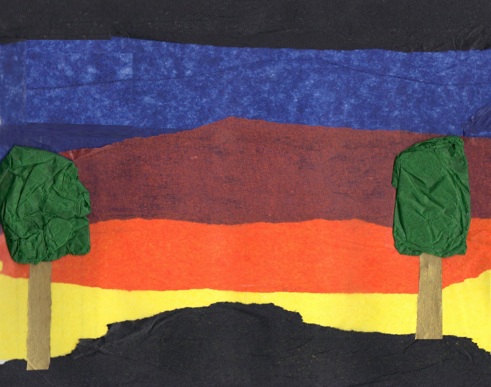
Using the images that I had scanned in I was able to start work on my Video first, as I thought that would be best because I could get everything sorted to then only use some of the main components for the Billboard, Magazine and Poster.
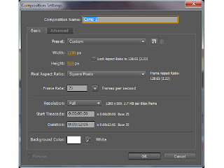
To begin with this is the screen that I get when I want to create a new composition. I have to choose the size of the composition, which in this case is 1280 x 720, which is standard for a widescreen video.
I also have to decide how long I want my video to be, which again in this brief has to be 30 seconds long, this is because normally adverts last about 30 to 60 seconds.
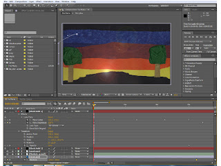
This is the screen that I have after opening the program After Effects. The next thing I had to do was to import all of the files that I would need to animate within my video. These could be either Illustrator files, Photoshop files, Jpegs or Gifs, it depends on the files that I want at the time. In this case I will be using Jpegs, Illustrator files and Photoshop files.
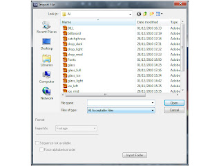
This is the window that I get when I want to import something, I also get asked if I want to make it a piece of footage, or a composition. And to make it easier for myself, I made everything that I imported into footage.
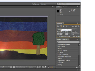
I also had to keep an eye of this window here, which has the frames per second in it, as long as it was at 25 frames per second then my video would run at the correct speed that I wanted.
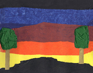
I had to use Photoshop to get the scenes that I had scanned in to the way I wanted, therefore to begin with I wanted the moon to rise up as it changed from one scene to another, therefore I had to crop out the moon from both scenes and then create a new file, which then made the moon layer.
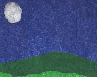
I also wanted to create the look that showed it was windy, therefore I had to use the same technique to cut out the trees to then make them sway in the wind as the clouds came across the screen.
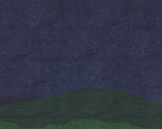
I then got told that my background images were not as dark as they should have been, therefore using Photoshop again, I copied a bit of the black tissue paper from the first scene and then made that piece partly see through, to allow the colours to come through and then copy that layer until the whole image was covered, to then create this darker image.
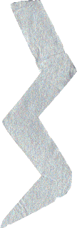
This lighting bolt I created to give me a way to make the different components appear, and after looking closer at dark things, I thought about a storm and that is how I came up with my idea, of having a storm, because lighting can create fire, and the rain can fill up a glass that I will create.
 This glass I created using an image from the internet of a glass. The way I created this glass was to first open a new document in Illustrator, and then use the line tool, and the circle marquee tool, making sure that the there was no fill, this is so the galss in see through, and then using the paint brush tool and different opacities of the same colour I was able to make the image look more like a glass. I then created another glass, with ice cubes in and then another one with the liquid and ice cubes in, this is so I can have each of the different stages.
However I found that I wanted the liquid to rise as it was raining and I wanted the ice cubes to move around seperately and the liquid rose, therefore I had to create the liquid and each of the ice cubes seperately.

 Here is the liquid and one of the ice cubes that I created using Illustrator. For the liquid I looked at a normal glass of Tia Maria to get the colours, I then founs that to add some sort of depth to it, I had to add different coloursm or at least different tones of the same colour, and with the ice cube I had to make it as pale as I could without completely not being able to see it, therefore I used a very light blue to go around the edges with.
 This image of the Tia Maria bottle I found by putting in a search into Google Images, I chose this bottle image because it is the most recent style bottle that there is, also due to it being quite a large image it is able to with stand being quite big, which means it doesn't get pixelated badly when I make it bigger.
 Here is the catchphrase that I will be using for my different forms of Advert. I had previously looked up different fonts at which I could use for my catchphrase, however after showing the class the different fonts they had chosen the same one that I was going to use. I chose this one because I wanted a font which had an old style feel (so like calligraphy), however have a dark side to it, which I felt this one had.
After getting all of my components in place and moving to the music, I showed my animation to one of the tutors, and they suggested about having more things happen in the first scene, especially as I did not really have anything happening. Therefore I decided to make my moon rise. As I was doing this, someone had spotted that my moon was rising in front of one of the trees, also it was rising too straight. Therefore, I made it so that my moon started off of the screen and then from the start of the video to when the scenes change, my moon would rise, until it is in the correct position for when the static moon faded in.
I also wanted to add something else, to give the impression that the sun was going down. Therefore, after having an experimentation session I found an effect which gave me that option. This was called Lens Flare. And I had it slightly moving giving the impression that the sun was setting as well as fading out as the scenes changed, this then made my scene change a bit more realistic.
I also wanted to add another effect that would fit in with the theme of my advert, and this was rain. I wanted to have rain in my scene because, generally with a storm there is rain, also this ment that my glass could get filled up. The way I found this effect was by slowly looking through each of the effects, and in the simulation section there was one calle CC Rain. The way I created it was to first make a new composition, which was the same size and the lower section of my animation, and then add in the background that I was using, I also made it about 12 seconds long, which is the length that I wanted it to run.
I then played about with the different setting and I found I could change the speed, angle and amount of rain I could have, therefore, using previous experiences of storms, I wanted to have it come in slowly and then get really hard, to the put out the fire, and then go quite soft and then hard again, this allows me to the fill up the galss realy for the end position.
 Once I had done all of my animation a tweeked what I needed to I then had to render my animation out into a .mov, which will then allow me to convert the .mov to a .ogv and a .mp4 (this process was so that people could watch and access my advert via iPods, iPhones, iPads etc.). I also had to render my video out as a H.264, which meant it is the best quality video I can make. The way I changed my settings was to first click on a part that said 'lossless' and I can change my video and audio settings there, and the change where I saved it I clicked on the one just to the right of the last one.
The way I convert my videos is to use a specific program called Miro. This allowed me to convert my .mov movie to a Theora movie, which can be played via Firefox and mp4, which can be played via QuickTime.
Once I had finished creating my Video I then had to start on creating my Billboard, Magazine and Poster. Creating these were very simple, in the sense that I had everything that I needed I just needed to put the components together in a way that looked good as a print ad.
To do this I used Illustrator, and to superimpose them into the points that I wanted I use Photoshop.
Here are the jpegs of the finished adverts:
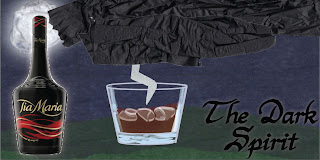
The one of the left is for the billboard and the one of the right is for the poster and magazine. I had to look up the sizes for the billboard so I could then scale it down to fit on the image that I had taken previously.
Here are the images superimposed onto the photos that I had taken previously:
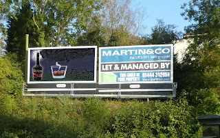
This is my superimposed Billboard Advert. With this advert I had to used the Transform tool and the scew tool, this is so I can fit is properly to the edges.
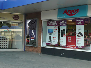
This is my superimposed Poster Advert. With this one it is the same as the Billboard, I just had to use the Transform tool to get all of the edges close to the edge of the poster.
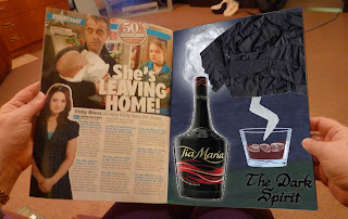
This is my superimposed Magazine Advert. However, with this one I had to use the transform tool to make it smaller, however, to bend it towards the edges I had to use the warp tool, which allowed me to make the advert look like it is in the magazine.