All of the graphics that I have chosen for my website I will be creating because then they would be all of my own original designs.
My ideas for my graphics were based on each page this was so I could demonstrate what I will be trying to explain.

The first graphic that I created was the colour wheel for my second page, I did this by using the same technique as I did with my logo. My idea for the colour wheel page was that when you either click on or rollover the words down the side of the wheel it would change to that word, for example if you clicked on or rolled over the word Primary, the primary colours would show up and an explanation would appear underneath.
Here is an example of one of the colours wheels that I had to create:

This image is the Analogous image that I will use when the viewer clicks on or rolls over the ord Analogous, as you can see I have decreased the opacity of the colours that I do not ant to use and then that leaves the colours that will demonstrate that particular word.
The next graphic that I created was for my website was for the Prism page, and for this page I had decided that I would like to use more then one graphic to explain the theory of the prism.

This graphic shows how the white light goes into the prism and comes out the other side as the 6 colours. The way I created this graphic is by first using the star tool and using the downwards arrow button to decrease the amount of points there were until I had a triangle I then used the line to to give the illusion of a prism, I then kept the line tool to create the lines of colour, and all I did was change the lines to the colours that I wanted.
This is the graphic that I used to expain the different frequencies that each of the colours have including infer-red and ultra-violet.
 The way I created this graphic was to first make a rectangle using the rectangle tool, and then using the gradient tool. Using the gradient palette I was able to change the colours and add points so it looked like a colour spectrum, I then added the wavey line by first putting a straight line in and then adding points and moving them and then changing each of the points to make them rounded.
This graphic is the last one I created for my prism page.
 Here I have created a image explaining how we see colours in everyday life. This graphic was very simple to create, I first drew the sun using the circle tool I then drew the leaf using the circle tool and then adding extra points and then changing them to make the shape, lastly I used the line tool to make the light.
The next couple of graphics that I created was for the RGB & CMYK page, these were to explain about how the different sets of colours were additive and subtractive. 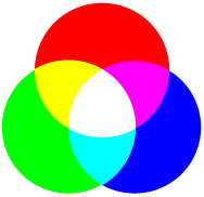

These 2 images I created using 3 circles, however because of the nature of these I have to use the 'Divide objects below' option this was so I could show each of the colours and demonstrate how these images are supposed to look.
This is the last graphic that I had created for the last page of my website.
 This graphic is supposed to be easy to understand and using the text that will be next to it in the website everything will fit together nicely.
This graphic was very easy to create all I had to do was create 3 indentical squares that will placed at each corner and then make the lines that connects them together.
Each of these graphics I had created so that the explanations that will be on my website will make sense and will be easy to understand.
Lastly, each of these graphics I had created first for my pitch so see what everyone thought of them and whether I should use them or not. Once I had shown them in my pitch I had found that everyone understood them easily and that I could use them in my website to help explain what I wanted to explain on each of my pages.


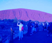 This is an image of Ayres Rock that I had taken about 5 years ago, I chose this image because of the heat that the place has and what I want to achieve at the end.
 This is a photo of a field that I had taken when it snowed heavily. I chose this image because of how cold snow is, and I want to change the image to achieve the end result.
 And the one that I changed to was:
 I had place a background colour to this so it would be able to fit in with the background colour of my page. Also due to the colours being gradient I had to save it as a Jpeg, and unfortunately Jpeg's do not allow for the background to be transparent therefore I had to place the background in, in order for the heading to match the background of the page.
 Each of these have been made different to show the different variables that I could have.
  At first I used my first idea for the buttons and then I changed them to the second idea.
  This is where I found out that my button size was too big and therefore I had to change the size of them to fit my site.
 This was my final idea, and the feedback that I got from it wasn't very good, this is because the buttons were too big, also I got told that there are no websites with the buttons on both sides of the page, the text in the middle should be left aligned, the heading should not have a shadow.
 Here I have taken into account everything that was said about my mock-ups, and I have changed the elements that needed changing and I have got a good website that works well for what I wanted.
 The feedback that I got for my wireframes use that it looked like I had thought about where I wanted to place things in detail, however the wireframe that I had chosen was a bad decision and that I really should have chosen a different one, therefore when I looked back to the other wireframes I then chose this one:
 However, I did not use 2 logos because I felt it would have been too much for the size of the page that I had created.
 My next idea was to use the colour wheel itself, as I have created here.
 I presented each of these in my pitch and the feedback that I got was that using my second idea would make the website look tacky and it would have been too much use of colour, and with my first idea I the feedback was they were too big, also no other website has buttons that appear on either side of the web page, therefore what I had to do was shrink the size and then maybe combine the ideas so that I would then have my buttons.
 I then thought that I would like to create a rollover image so that the buttons moved slightly when the viewer rolled the mouse over them, also I would then have the rollover image to stay when the viewer clicked on the button, this is so they are able to see which page they are on.
 As you can see here I have moved the text along and I have increased the length of the triangle.