To begin with I have found this project to be interesting and I have really enjoyed it.
I have seemed to get on well with After Effects, and I feel I have used a wide range of different effects and techniques to create my 3 animations.
I feel I have worked well given the time that we were given, and given the fact that I did not have After Effects at home, also I have used my time well, getting everything done before the deadline day. Which allowed me to come in earlier, and finesse my work, before my 'Crit' Session.
In regards to my animations, I am very happy with all three of them, this is because I have worked hard on them to make sure they match the brief, to the best of my ability.
I also like the fact that they all have similar types of music (objects making the sounds), this is because I was able to use a range of different techniques to make them different and original.
Here is my third finished animation, which I have again rendered into a Quick Time movie.
I feel that the colour scheme of this idea work because the music is from the 1920's and therefore the films would be in black and white, so I wanted to emulate that. Moreover, I wanted to make one of animations different from the others and I felt that I have achieved that.
The movements of this animation are flowy and simple because the music is fairly simple and flowy, however, there are places where the music is a bit choppy and thereofre I have used choppy movements.
I feel that this animation works well with the theme of the music that I have chosen.
Here is my finished Bins Animation, I have rendered it out into a Quick Time movie.
I feel that I have used the Bongo Animation to my advantage, because I was able to learn from it and then adapt this animation to make it better.
The colours work well, because first I got the swatches from Kuler, therefore I was able to use authentic colours, which would go with the theme of my music.
The movements that I have chosen are jagged, this is they way I wanted it because the music is very clangy and metallic and therefore it fits in with the theme again.
All in all I feel that this animation fits the brief that had been set.
This is my final Bongo Animation, which I have rendered into a Quick Time movie. I feel for this animation after changing the colours I feel that the idea works well, in comparison to when I had the primary colours. The lighting problem that I had, at the beginning, was that the beams of light did not look like spotlights, therefore to solve that problem I found a lighting effect that I had put onto the triangles, and once I did this I found that they then looked like spotlights.
To begin with I was going to use the primary colours, because this would have gone with the primary shapes that I have used.
However, after showing my animations to my tutors they pointed out that using the primary colours didn't really fit with the themes of the music, therefore after doing a bit of research I had to change the colours to ones that fitted.
The first one that I chose for my Bongo Animation was called Bongo. I felt this colour swatch was best because there are natural colours, with a light blue which is what I wanted.
These 2 (above and below) I found to use for my Bins Animation. I chose these 2 because the music is from a group called Stomp, who use physical bins to create the music. Therefore I used bin like colours for my animation.
And for my Varese Animation I have used grey scale colours, with black and whites. As well as a bronzey colour. I chose these colours because I wanted this animation to be a bit different in comparison to the other 2 animations. As well as the song, Hyperprism, had been created in 1923 and the other 2 are more recent.
To begin with I decided to chose Edgar Varese because in comparison to my other 2 animations this shows a different style, however still inkeeping with my theme of music being created by different objects and sounds.
With this animation I first had to cut up the music, which would allow me make my animation easier. I did this by using Audacity. I first opened the original music within Audacity, I then found my section of music, I then selected it and I cut it out of the original, I did this by pressing Apple+X on the keyboard (which is a short cut for Cut). I created a new file for me to paste the section of music into. I then exported it as an .wav, which is a format that After Effects can work with.
Here the section of music I selected for my third animation, and using the wavelengths I will be able to figure out the points, which I will need to make object move.
I first made my objects in Illustrator, this is because I wanted to have gradients on them, this is so I can make this animation seem like an older version of the other animations, (by using greyscale and black and white, like old films). I first began with the star in the middle of my screen, emulating a singer or something similar. To create the movements from my storyborad in After Effects, I had to use the Puppet tool.
The puppet tool allowed me to pin down the points I did not want to move and I did want to move. I started by pinning down each of the points of the star. I then dragged the 2 side points upwards, as well as moving the slider to the point at which I wanted the star to move to.
I made sure that I moved the star to the sounds of the trumpets, so that it would make it look like the star was make the trumpet sounds.
I used the Wiggler again for this animation, this is so at the time when the maraca sounds were played the straight line across the screen would vibrate, which in turn would make the balls that were on it, at the beginning, roll off and create the drumming sounds. However, instead of making both balls bounce I thought that instead I would make the smaller one bounce to the faint drum beat after the bigger one fell like a connonball. And making the bigger one like a cannonball will mean that the audience could tell the difference in the sounds.
I did have trouble with what I was going to do in the middle of my music where there were many different sounds, mainly because I couldn't think of a simple yet interesting way to pull it off. I then thought of objects falling on top of each other creating something like a totem pole, and so to everything sound (which in the end turned out to be about 7 sounds), I had objects falling and then landing on top of the last object that fell.
I then used the straight line to push of the top 2 blocks, in time with the music.
After having created my star I decided to create a duplicate star, which at the end will steal the spotlight from the bigger star. However, I found that to begin with having to 2 stars the same colour didn't make the second one stand out as much as I would like, therefore thought that I could change the colours or tones of the second star to make it stand out.
This is the tools at which helped me change the colours. I chose the colour that I did because in older films, tey started in black and white and then started changing to a bronzey sort of colour.
I changed my mind on the timings because I felt that I could do more with this last section I have picked. It is between 1 minute 18 seconds to 1 minute 34 seconds (1:18 to 1:34). I first used Audacity to cut up my music and this allowed me to sut it up very specifically to where the music faded in and out easily.
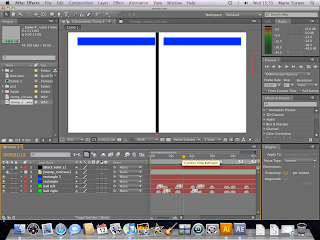
I had to use my storyboard at which was in my sketchbook to create this idea. I first began with a single black line, which I placed in the middle of the screen. This black line would allow me to have the objects use it as a way to emulate that the objects are creating the sounds. The way I created the black line was by creating a new solid, and then changing the size of it by using the cursor and the corner, and then dragging the corner inwards until the black line was the size that I wanted.
This particular song is quite hard to determine where each of the sounds are, therefore I had to extend the music layer to allow me to see the wavelengths, which then allowed me to point out all of the different sounds by both looking at the music and listening to it at the same time.
To make the first sounds that the audience hears I used to rectangles that would come from each side of the screen and bang into the black line when the beat would sound. I also wanted them to be more realistic in their movements, therefore I decided to have the rectangles bounce against the edge of the animation, and then pull back, which would then show anticipation.
The way I was able to mark out the places where my objects would banging together was by using the wavelengths, and listening to the music at the same time. Then by pressing on the star key on the keyboard, these small markers would appear on the timeline, and this was a great deal better then guessing, this also meant I didn't have to listen to the song over and over again, I would have all of my markers worked out, and this allowed me to get more done quickly.
I then had to created my balls that would come out from either side and use the black line as a wall and bounce off of it, creating the sounds. I began by first creating a new solid, and then using the circle mask tool I created a circle. I used balls for the sound because I felt that they would be the best and emulating the sound, as well as they could move at the correct speed.
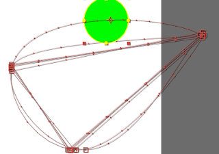
Here are the paths that the same ball would take. As you can see there are 2 paths that are rounded and the others are straight, which was not what I wanted. I therefore decided to copy the keyframes from the first loop, and then I pasted them in the places where I wanted my balls to bounce. (I also did this on the ball on the other side as well).
I then found again I would have to use squash and stretch to make my balls more realistic. so when my balls hit the wall and the floor they would squash and then within the places in between they would stretch.
I then got suggested by one of my tutors that I should maybe have the balls changing colour alternately. Therefore I duplicated the 2 ball layers to make 2 exact copies and then I would have one of the balls (from each side) one colour and the other another colour, this would then be seen as the balls changing colour each time they went off screen and then back on screen.
I also tried to put a motion blur on the balls, however, due to the speed at which they were travelling in, they looked better without the blur, mainly because the motion blur made them look too blurry.
I also used the Wiggler with this animation as well as the Bongos animation, I used it when the 2 blocks from the top and the 2 blocks from the bottom came together in the middle, this would make them look clunky, which was my goal, because the movements fitted with the song that I had chosen. I again had to experiment first, because then I could get the movement perfect to the section of the song that I had chosen.
Here is a screen shot of my video after being rendered to a Quick Time movie.
To demonstrate how I made my work and the process at which I had taken I have taken screen shots of my work as I went along, and here I will be explaining each step.
To begin with I had to open up After Effects, and then create a new project, including a new composition. When I created a new composition I had to put in a few settings that we got told that we had to use, for example the size which was....
I then had to start with a black screen, which would allow me to fade into my animation. I also wanted to have the background as black (or dark grey), this is so I can show the spotlights, which I wanted to use to create the staging for my animation. The way I made the background back was by using the composition settings and changed the colour to black. I then created a new solid, which would allow me to have a fade in, I right clicked within the areas where all of the layers are and then selected New/Solid, this is where I could change the colour and the size of the solid, and in this instance I wanted to have it the same size as my animation screen.
Here are all of the layers and objects that I had created to get my animation.
I first began with creating the first objects that would be seen, which were the first spotlight and the 2 yellow triangles. The way I created the spotlight was to have a mask of a triangle over the background colour. The only way of creating a triangle was to use the star mask tool and then by pressing on the down arrow key (on the keyboard) I was able to limit the number of points to 3, which consequently created my triangle. I then used the same technique with my yellow triangles, except the way I did this was to first create a new solid, then using the star masking tool I created the triangles.
The first action I wanted them to do was sway from side to side to each of the beats, and the way I created this was by using the rotation tool and moving the slider along the time line at each of the places that I wanted the triangles to hit each of the beats. However when I showed my initial design to my tutors, they pointed out that there was a big gap from when the music began to when the movement began, therefore I decided to have the triangles walking towards the front of the scene, however to making it a bit comical I decided to have one come in a little later then the other one, to emulate that one was late and therefore trying to catch up so they do not miss the start.
I then want to have another spotlight lighting up the second solid that will be creating another section of the music, therefore I duplicated the original spotlight and changed the position, and to make it come on when I wanted it to, I used the opacity tool on it (making it 0%), and using keyframes, I placed the slider where I wanted the spotlight to come on, however if I kept it like that with only one keyframe I found that the opacity would change gradually, therefore I added another keyframe just before the 'on' keyframe and I made the opacity 100%.
To make the rectangle move to the beat and making it bang at the moments I wanted it to bang, I had to again use the rotation tool on it, however I changed the position of the ancor point to the bottom of the triangle to make it look like it was in a fixed position and could only move the top.
I then had the third spotlight appear, when the last bang sounded, and this revealed a ball, as well as 2 other triangles abover the original triangles. The ball would create the beat for the second part of the song. However, I did have an issue, because in real life a ball doesn't start bouncing by itself therefore I thought about having a stick come in and tap it to make it bounce to the beat. The green traingles where also part of the second section of the music, this is because I found that there were to different bongo noises at that point, which then made me add in these other triangles to allow for the other bongo sounds to seem like they are being created by another object(s).
To make the ball more realistic, I had to use the principle squash and stretch. Basically, I used the scale tool, the position tool, and the slider to make my ball seem real as it bounced. To begin with, when the ball hit the bottom of the screen I made it squash and as it fell and raised I made it stretch, and then only point that the ball would be normal size is at the top before the ball began to fall.
At the end of my selected music I had a section which I need to have something else to create the sound, I therefore thought that as I am using the primary shapes I would use a square. I wanted the square to move upwards, grow and shake all at the same time, because this would fit to the music. Therefore I had to use the scale tool, to make it grow, the position tool to make it go upwards. I then got taught how to use the Wiggler. This allowed me to make it shake.
The way I used this tool was to select the 2 points from my position section, and then select how many times I wanted the object to shake per second, I also had to select how much I wanted it to shake. To get the square shaking perfectly I had to experiment, until I got the right settings
This is a video of the song Bins by Stomp, and I will be using the section of music between 1 minute and 50 seconds to 2 minutes and 10 seconds (1:50 - 2:10), this is because I thought this part had the build up and fade out that I wanted, as well as having different beats that I could use.
This is a video of the song that I decided to use called Hyperprism by Edgar Varese, I will be using the part between 25 seconds and 41 seconds (0:25 - 0:41), this is because again it has the build up and fade out that I wanted, and as well as having quite a few different sounds for me to animate to.
This is the last of my chosen songs, this is The Bongo Song by Safri Duo, and I will be using the part between 0 seconds and 20 seconds (0:00 - 0:20) (the beginning), this is once again because it has the build up and fade out that I originally wanted, as well as having many different sounds and beats for me to animate to.
After looking for the 'Bins' song and 'Hyperprism' song in iTunes and Limewire, as well as looking if there were any CD's that I could buy, I found I was able to buy 'Hyperprism' through iTunes, but it was not the same as the one I had previously found on YouTube, also I had no luck with the 'Bins' song, the only way I could possibly get it is by buying the DVD and then extracting the sound, which would have taken up time.
I then was told (by my dad) that he could extract the music from the video, from YouTube, using a programme that I linked to Firefox. This process begun with him opening this programme, within Firefox, and then going to the correct video within YouTube, and just below the video itself, and below the 'embed' button, is another button that allows you to click on it and a drop-down menu appears, which asks you in what format do you want to video/sound converted to, in this instance we converted the music to a MP3, we also got the option of having it in Standard Quality or High Quality, therefore I chose the High Quality. And after listening to it, I found it is really good quality.
Whilst I was sketching out my ideas I started listening to a song, which then gave me another idea. However this time I felt that it would have been better then the other ideas, I then explained my idea to my tutor, and he then suggested why didn't I do all 3 animations on the same theme, except use different types of music. Therefore I decided to then change the whole theme of my project, even though I had extensively looked into my other ideas, I felt that this idea would give me more oppotunities to be more creative, in both the design and animation. Now my new theme is having simple shapes moving to make them look like they are creating the sounds and music that the audience will be able to hear.
The first song that I listened to, which made me change my mind, Played Alive (The Bongo Song) by Safri Duo. This song gave me the inspiration to do something different, and that can answer the brief better.
One of the tutors gave me the name of someone who did something similar, they made music with an aray of different instruments (not the conventional ones), the name of this person is Edgar Varese. I then looked him up on You Tube to see what kind of music he did. I then found there were a few of his pieces that I liked, one was called Ionisation and another one was Hyperprism. I listened to both of them to decide which one would be better for this project, I then decided that I would use Hyperprism.
I then had to choose a third piece of music that was different from the first two. I then remembered a group of people that created music using random everyday objects, for example plungers, bins, chairs etc. This group was called Stomp. I then had to decide which one of their many songs I was going to use. I listened to quite a few of their songs, for example Bins, Plungers and Brooms. After listening extensively to each one I then decided on using Bins for my final animation, mainly because I was able to use the beats that were created.
There will be a common link between these 3 animations, and that will be a build up of sounds in the beginning and then a fade out of sounds at the end.
After creating a mind map to allow my ideas to follow I found that I had come up with some interesting ideas for my themes.
Machinery: I thought about doing this topic since the beginning, mainly because I found a piece of music that would fit perfectly with it, also I could used the different parts to create an abstract piece of animation, that I feel would coincide with what the brief says.
Here are a few images at which I could use to help me create my abstract machinery animation. I feel that using images like these would help because they could give me an insight into what I would need to think about when designing my animation.
My next idea I came up with was called Life of a Family. This is where I would use simple shapes to demonstrate either a normal day of a standard family, or to demonstrate a special occasion that the family would go through, for example a family get together, birthdays, wedding anniversaries etc.
Here are 2 images at which I had found to help me portray the image of a family that I would have liked.
However, after attempting to storyboard this idea I found it wasn't as good as I first thought, mainly because I thought that I would end up copying the bupa advert, therefore I decided not to pursue this idea.
The next idea was something the is a bit darker in theme, it is called Bullying. With this idea I wanted to demonstrate how bullying can affect a person, whether they are a child or and adult. To do this I thought about a balloon and maybe something that would come along and pop it.
I did think about the fact that normally, bullying happens in schools, mainly to children however I wanted to keep the place open to interpretation, therefore I do not want to use a stage or background that would be recognisable.
Another theme, following on from the Bullying theme, is Abuse. Even though abuse has many forms, for example child abuse, sexual abuse or physical/mental abuse, I still don't want to use a specific theme, and by doing this means it would reach out to more people, because I have again left it up to the audience to interpreate how they want.
The way I would demonstrate this theme, is by using one object to be something easily breakable, for example a sheet of glass, and another object to be something like a ball, which throughout the animation would slowly break the glass until we are left with a shattered piece of glass in the middle of the screen. This would symbolise the soul of the victim being broken, after being abused.
The next theme that I cam up with was Love Triangle. I came up with this idea from my own mini experience, and therefore I would be able to use that as a basis to create my animation.
The reason why I decided to pursue this idea is because I thought about what I could use, I could use the primary shapes, square, triangle, circle etc, to create the people who are involved, and again use different shapes to then set the scenes at which to explain what is happening.
Here is an image basically explaining how a love triangle works, where either 2 men are after 1 woman, or 2 women are afetr 1 man.
After again attempting to storyboard this idea I found it difficult to demonstrate my theme, especially as a love triangle is very emotional, and I couldn't show emotions without showing faces very easily.
Another idea that I came up with was Boxing. The reasoning for this is because I started to listen to the song Eye of the Tigar, and the got a few ideas about how I could create a boxing animation, for example running up stairs, training, as like from the Rocky films.
These 2 images I would use for my animation to demonstrate the boxing theme. To create my character I would have just had the 2 gloves and triangles for the shoes. And with this image on the right I would have used that to come up with an idea for the ending of the animation.
After watching this video I have established that it has quite a few of the motion graphic design principles that had been listed earlier.
Squash and Stretch
Anitcipation
Overlapping Action
Staging/Exaggeration
http://www.youtube.com/watch?v=vksgbsPxXLo This is where I found this video, however I first saw this video on television, and therefore I found it relevant for this project.
Again after looking at this video I have found that there a number of the different motion graphic design principles that would apply to this, they are:
Speed of change
Arcs
Squash and Stretch
Overlapping Action
Staging/Exaggeration
Each of these videos are helpful for my project, because each of them demonstrate that you can use simple shapes and colours to convey an idea.
The first and second videos are about Bupa, which are a health insurance company, these are just 2 of their many television adverts. I chose these 2 because they were able to show an arrange of different shapes and colours all working together to create a storyline for which the audience would engage with and maybe even connect with. I think the point of these adverts are to portray the fact that if people had bupe health insurance it would be simple and easy to understand.
The last video was from a television advertisement that I had seen on the television, whilst I was doing my work. It is for a child help center, this is to help them with their maths and english. The way that the put this idea to the country is by using a typical childrens song, however changing some of the wording to make it about the product, and getting children to sing it, this would make the viewer more inclined to use the product. The reason why I chose this video is because they use simple drawings, as if a child had done them, to demonstrate their point. For example the fish jumping across the words as and when they are being said/sung.
After closely studying each of these videos and determining what motion graphic design principles relate to them, I have noticed a few similarities between each of the videos, to begin with they each seem to be staged, this is because they each are telling a story to get the audience involved and interested, also they each have the squash and stretch principle within them, I would suspect that this is because each of the producers would want to make their characters or objects seem real, even though they are animations.
There are 6 basic motion graphic design principles, they are:
Squash and Stretch - is when an object, within an animated action is distorted to convey the physical properties and to make the object more realistic, for example a ball bouncing up and down.
Anticipation/Motivation - is when an object is preparing for the action, for example a rocket shaking for before it takes off.
Timing - is when different object move at different times to then create a sense of weight and size of the objects.
Exaggeration/Staging - is where the action at which the object is doing is exaggerated to the point when the idea is unmistakably clear.
Pause - Look in Motion graphic design book for explanation.
Acceleration/deceleration - is where it 'helps establish natural movement' (Motion Graphic Design and Fine Art Animation, Jon. S. Krasner, pg 145), especially in real life things spead up and slow down.
These I found using Google Books, the book is called Motion Graphic Design & Fine Art Animation: Principles and Practice, by Jon. S. Krasner.
However, I have noticed that in the brief there has been mentioned other principles that would be helpful towards creating a better animation. Those other principle are:
Speed of Change - is spacing of the in-between keyframes to achieve natural movement.
Arcs - is the visual path of action for natural movement, for example when a ball is thrown into the air it doesn't fall straight down, there is a curve/arc.
Motion Blur - is used to enhance the movement of an object, for example as an object flies throw the air, there is a motion blur to make it more realistic.
Follow Through - is when the action of an object is finished, for example a golfer swinging to hit a ball, his/her swing carries on even after he/she has hit the ball, he/she doesn't stop as soon as they have hit the ball.
Overlapping Action - is when a second action starts before the first action ends, meaning there is always for the audience to look at.
http://vimeo.com/2528517 This is the website at which I got this video from.
I chose this video to demonstrate the different principles of motion graphic design, in a way that was simple and easy to understand. I feel that this particular video is helpful to demonstrate and explain each of the key principles of motion graphic design, and using simple white shapes and a black background to demonstrate means that the focus is on what the video is explaining instead of anything else, which consequently means there is nothing to distract the viewers attention.
http://www.youtube.com/watch?v=In1tNdTFat8 This is where I found this video.
This video I feel helps me with ideas on what I could do for my project, mainly because this video uses simple coloured shapes, which have been put together to then create a figure of a person or character. And there is also a very simple and plain background, which allows all of the viewers focus to be on what is happening. I have noticed that this video contains different motion graphic principles, at which I will have to use as well. One of these principles is Motivation/Anticipation (Preparation for an action), this is where the person is simulating walking, making the audience notice what is happening, another principle that I have noticed is Overlapping Action (Establishing its relationship to the next action), this is where the bullet penetrates the person and then shatters the pieces apart, another one is Follow Through (Termination of an action), this is where after the bullet has hit the person, and the pieces have shattered apart they land is particular places, which could be personal to the artist, and finally Staging/Exaggeration (Presenting an idea so that it is unmistakably clear), this is basically where the person is placed in the video (in the middle in this case). Many times each of these principles are used together, because they can relate to each other.
http://www.youtube.com/watch?v=VaLESWaRMjU This is where I found this video
This video is an interesting example of how to make a ball look normal, when thrown and bounced. This video is demonstrating another motion graphic principle, which is Squash and Stretch (Defining the rigidity and weight of an object by distorting its shape during an action). This video also visually allows the viewer to understand how the ball moves and distorts as it bounces, which then allows a designer to make their ball design look realistic.
In this assignment, I will be exploring the key principles of motion design, and I will produce three pieces of animation which will illustrate and demonstrate a range of these animation principles.
I will design, storyboard and make 3 pieces of animation which use shapes rather than complex drawings or recognizable objects. Given that the graphic objects are relatively simple drawings, the choice of colour palette is an important design concern. These animations will be between 15 and 20 seconds in length each, and you will vary the number of elements you are animating from one to many across the animation. Each animation must have a music or sound track of your choice.
I am 22 years old, I have got a fantastic boyfriend who I have been with for the past 5 and 1/2 years, and still going strong and once I have finished my course I hope to go into the computer animation business.









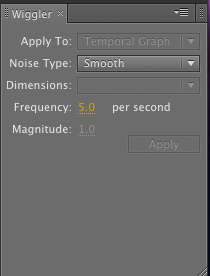 The way I used this tool was to select the 2 points from my position section, and then select how many times I wanted the object to shake per second, I also had to select how much I wanted it to shake. To get the square shaking perfectly I had to experiment, until I got the right settings